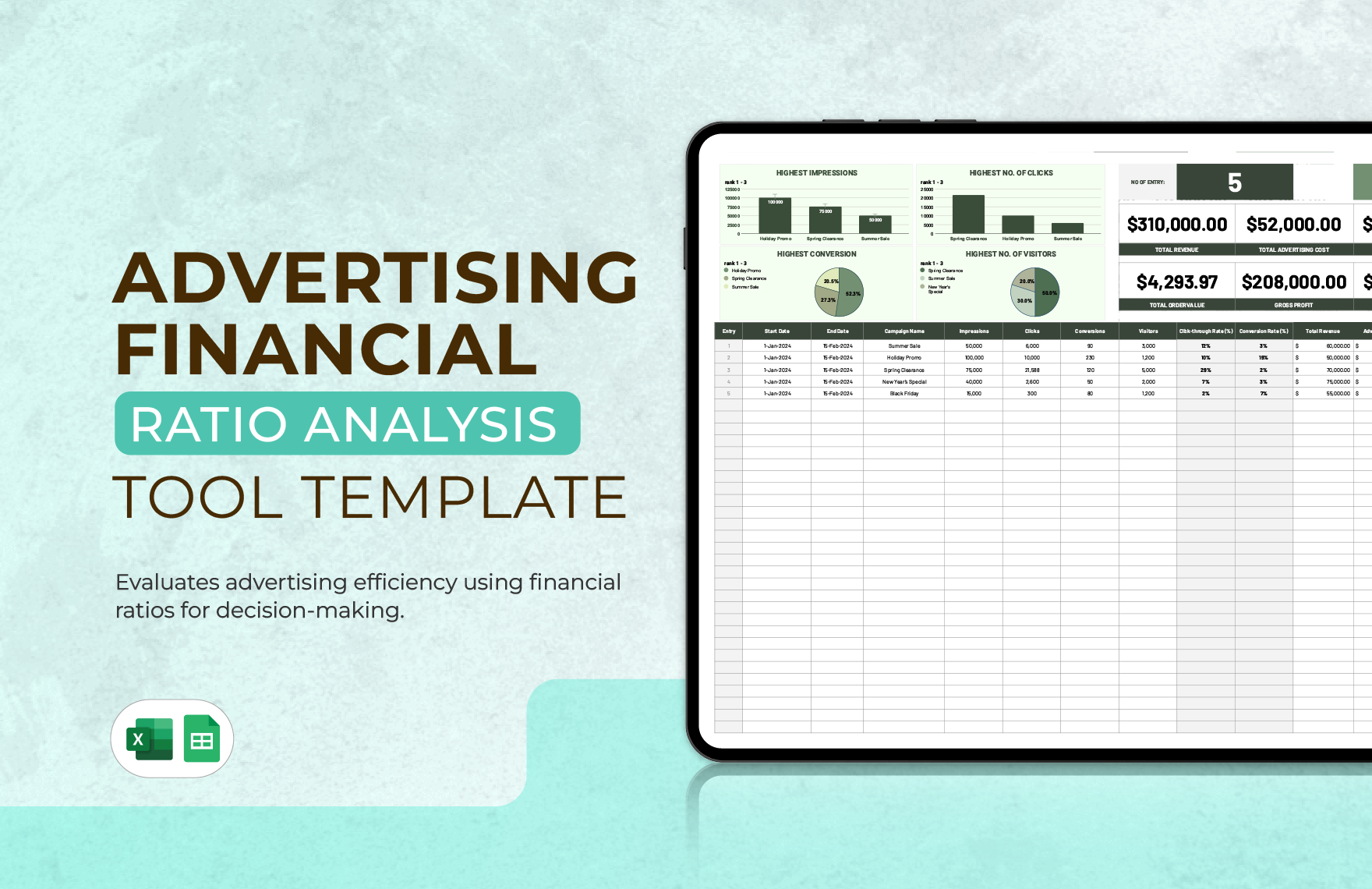
Financial Ratio Analysis In Excel Template has become an indispensable tool for accountants, analysts, and business owners who need to transform raw financial data into actionable insights quickly and accurately. By leveraging a well‑structured Excel template, you can automate complex calculations, visualize trends, and compare performance across periods or against industry benchmarks—all without writing a single line of code. This article walks you through the core components of an effective financial ratio analysis template, explains why Excel remains the platform of choice, and provides a step‑by‑step guide to set up, customize, and interpret the results for strategic decision‑making.
Why Choose Excel for Financial Ratio Analysis

Excel’s ubiquity in finance departments worldwide is not accidental. Its grid‑based interface mirrors the layout of financial statements, and its built‑in functions—such as VLOOKUP, INDEX/MATCH, and array formulas—make it possible to link raw data to calculated ratios dynamically. Moreover, Excel supports pivot tables, conditional formatting, and charting capabilities that turn static numbers into vivid visual narratives. When you combine these features with a purpose‑built template, you eliminate manual errors, accelerate reporting cycles, and empower non‑technical stakeholders to explore “what‑if” scenarios with confidence.
Core Components of a Financial Ratio Analysis Template
Data Input Sheets
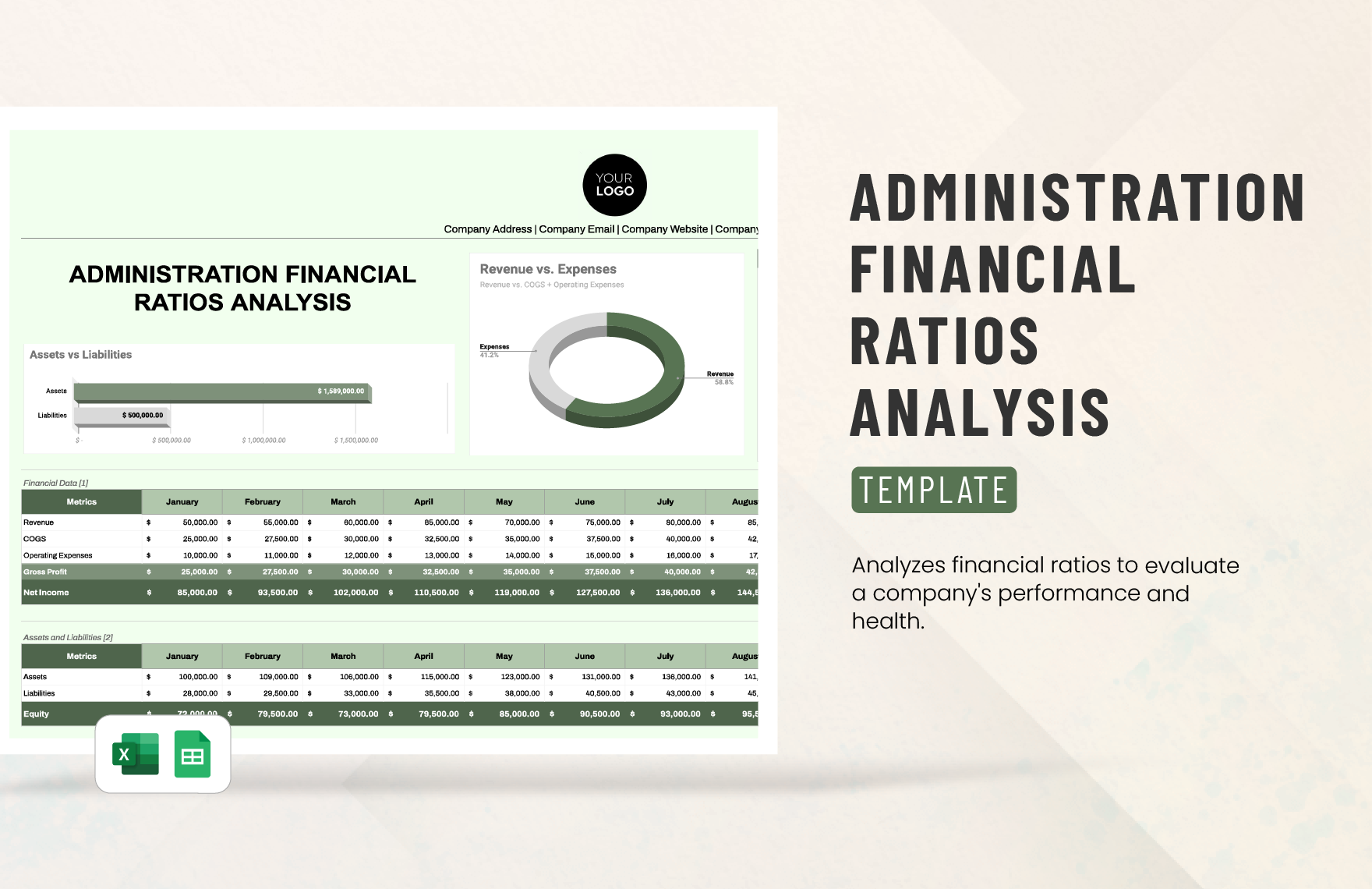
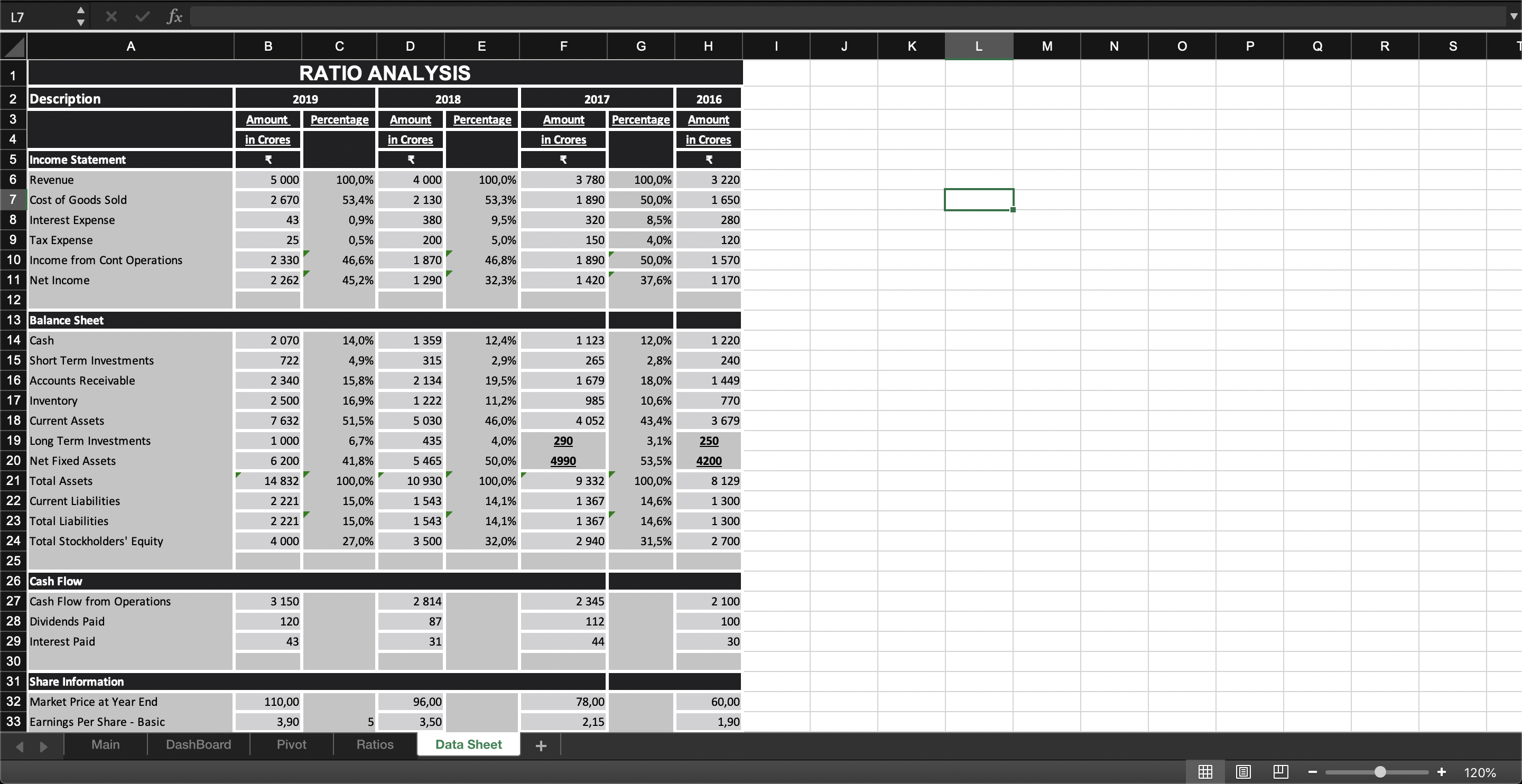
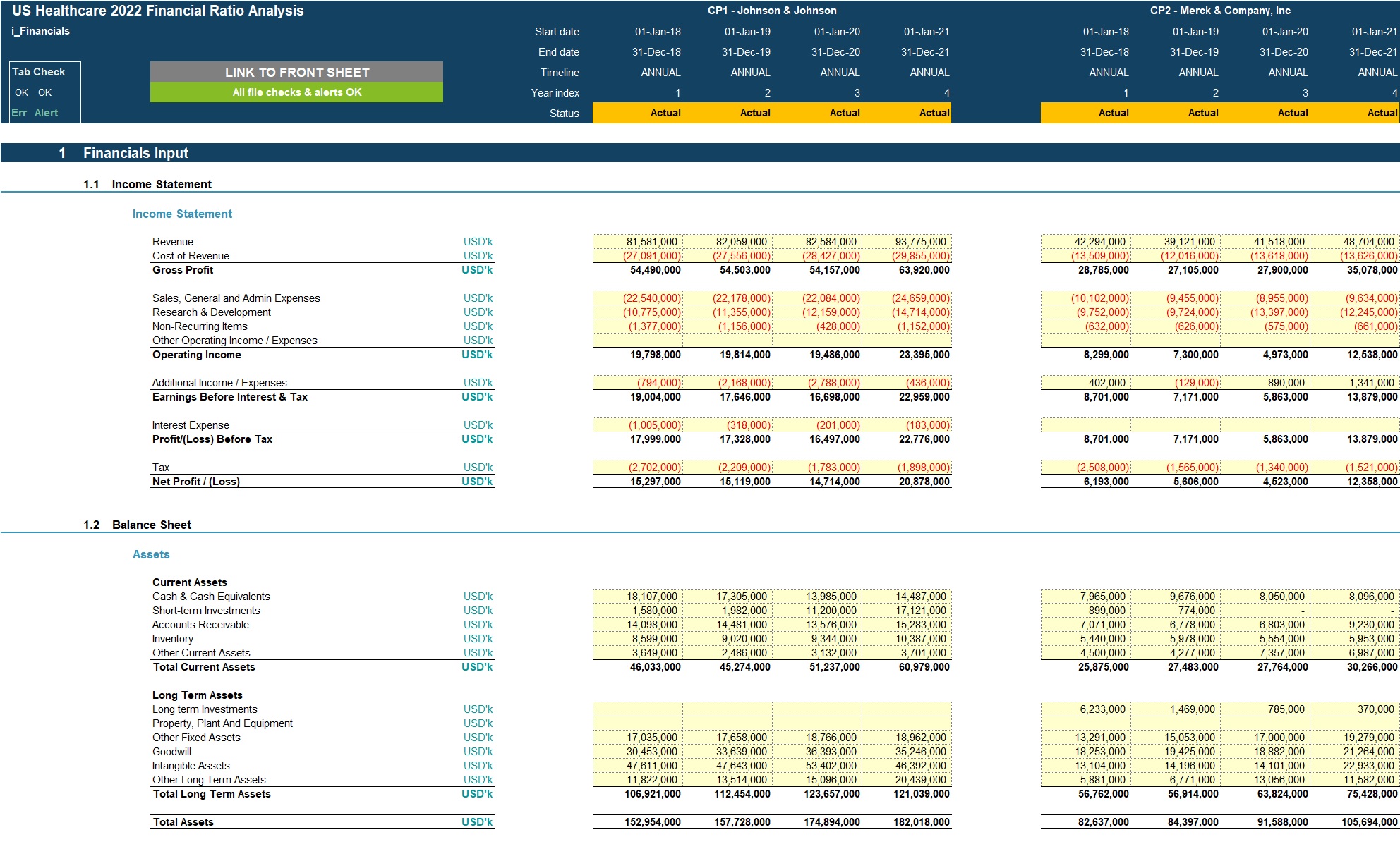
The foundation of any ratio analysis model is clean, well‑organized raw data. A typical template includes separate sheets for the income statement, balance sheet, and cash flow statement. Each sheet should have consistent column headings—usually representing fiscal periods (e.g., Q1 2023, Q2 2023) or fiscal years—so that formulas can reference cells reliably. It is advisable to lock these input sheets or protect them with a password to prevent accidental overwriting of formulas.
Calculation Engine
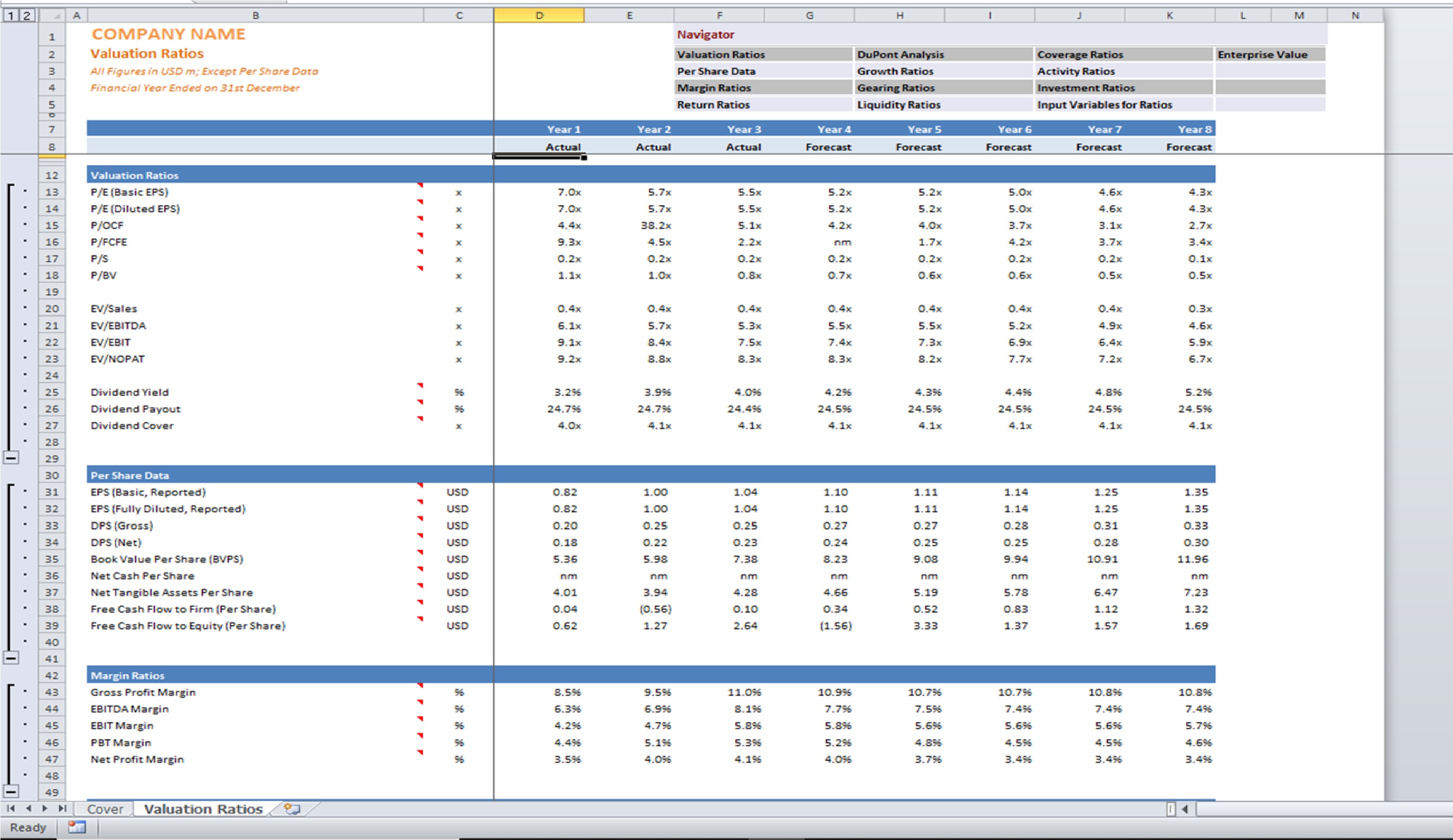
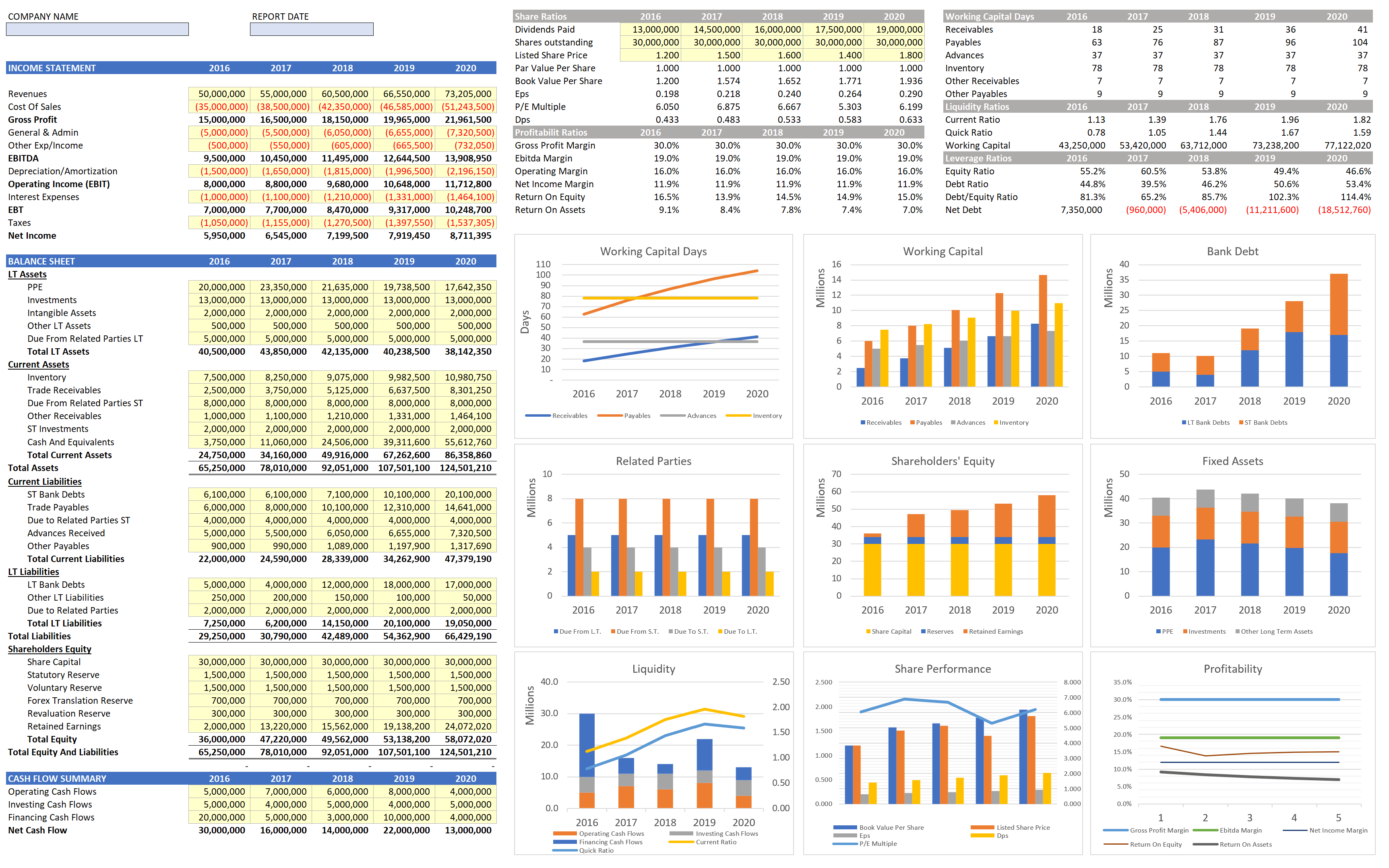
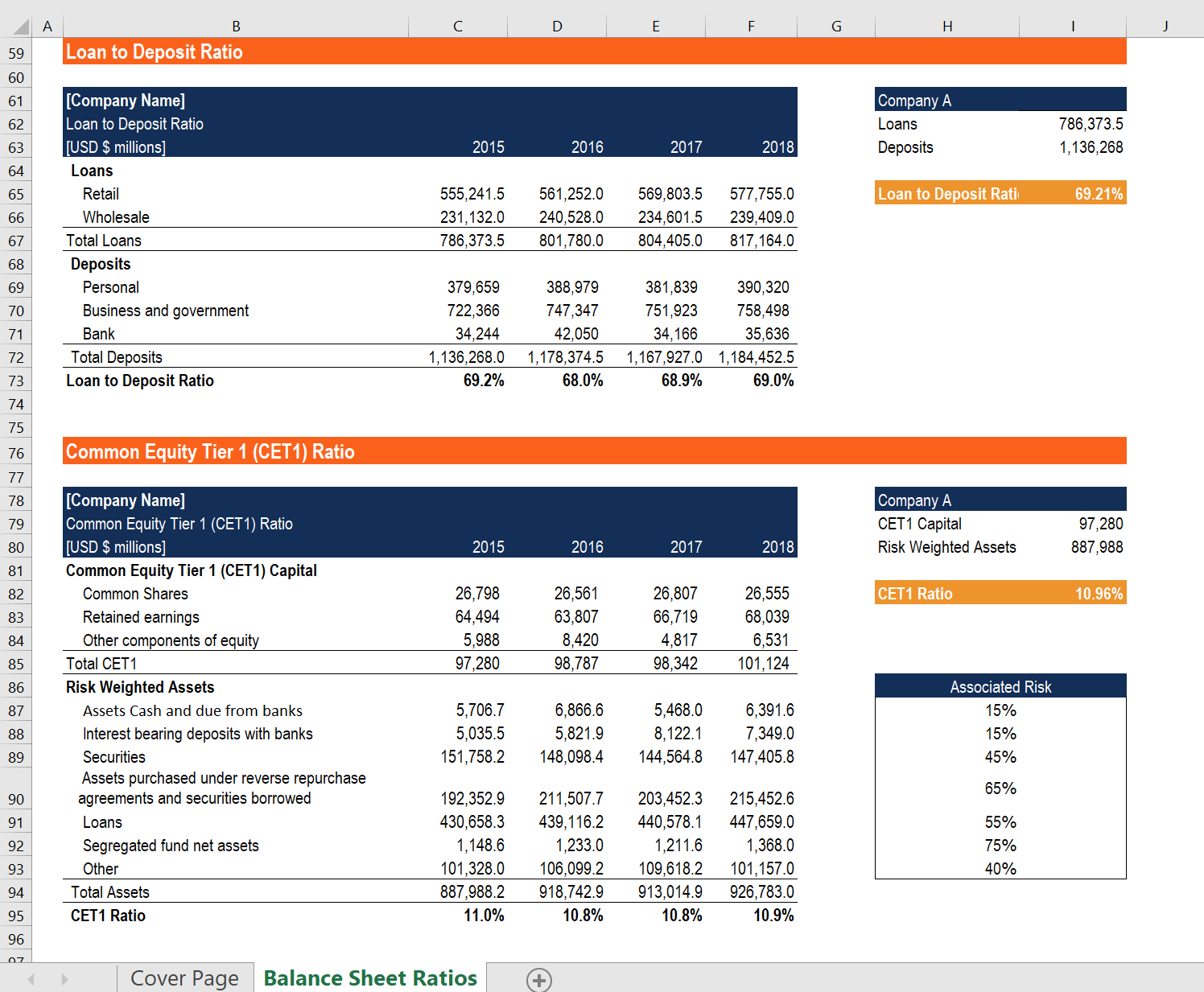
The heart of the template is a dedicated calculation sheet that derives each financial ratio from the raw data. Common categories include liquidity ratios (current ratio, quick ratio), profitability ratios (gross margin, return on equity), leverage ratios (debt‑to‑equity, interest coverage), and efficiency ratios (inventory turnover, asset turnover). Each ratio is built using transparent formulas that reference the input sheets, allowing users to trace the source of any result instantly. Using named ranges (e.g., CurrentAssets, TotalLiabilities) enhances readability and reduces the risk of broken references when the model is expanded.
Dashboard and Visualization
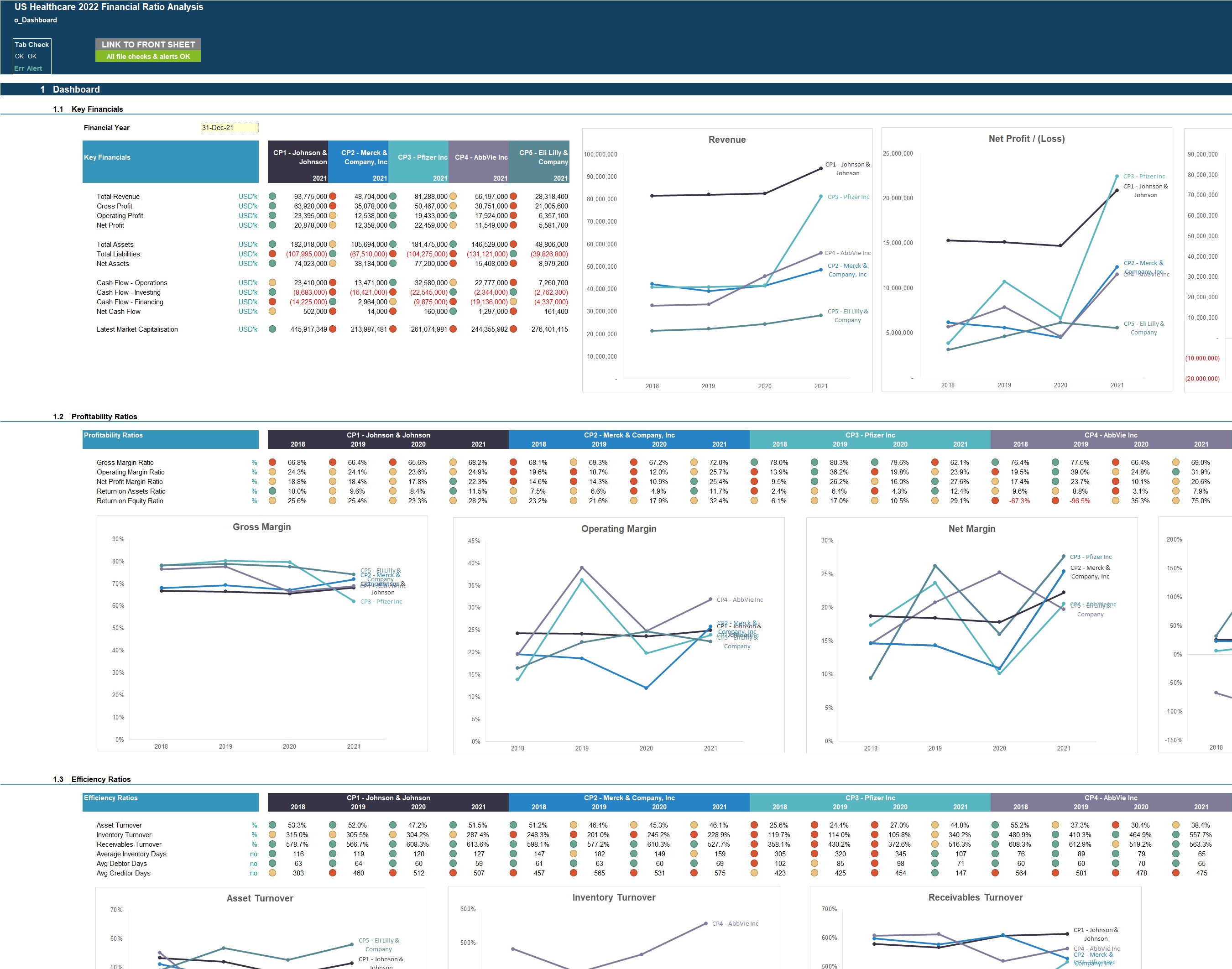
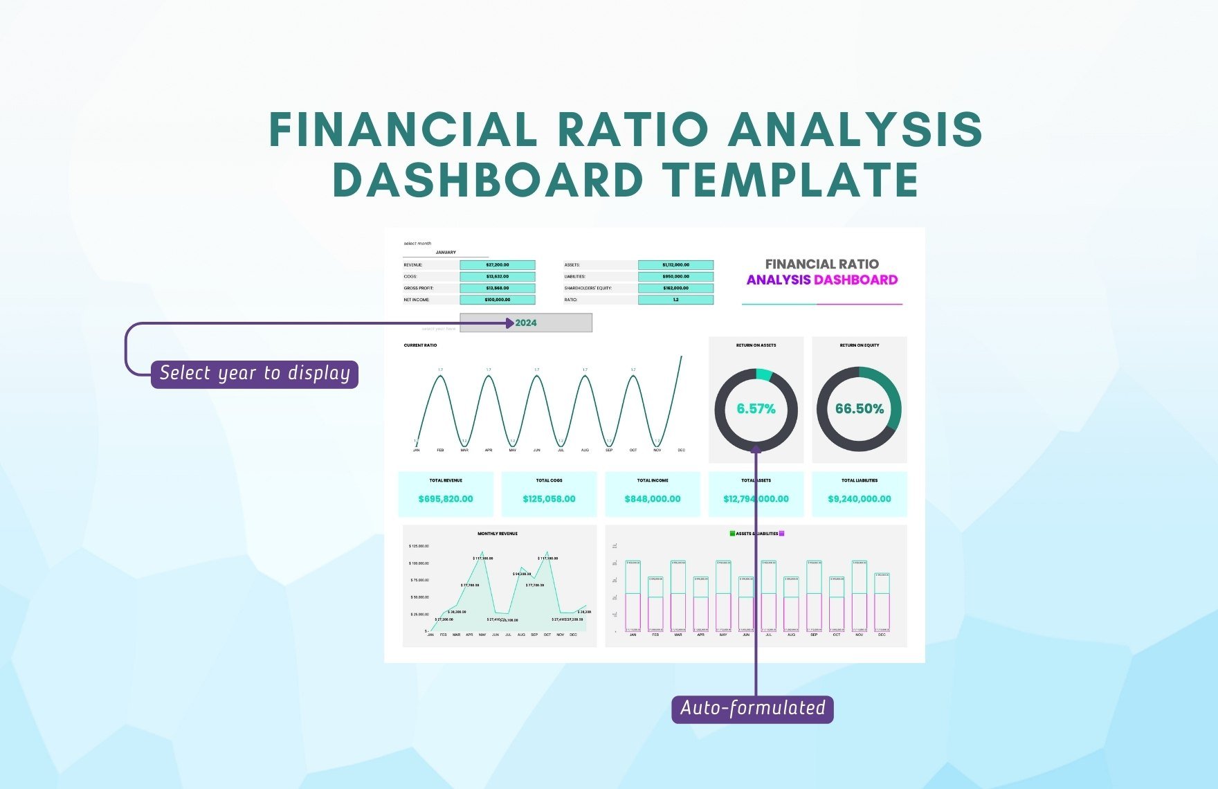
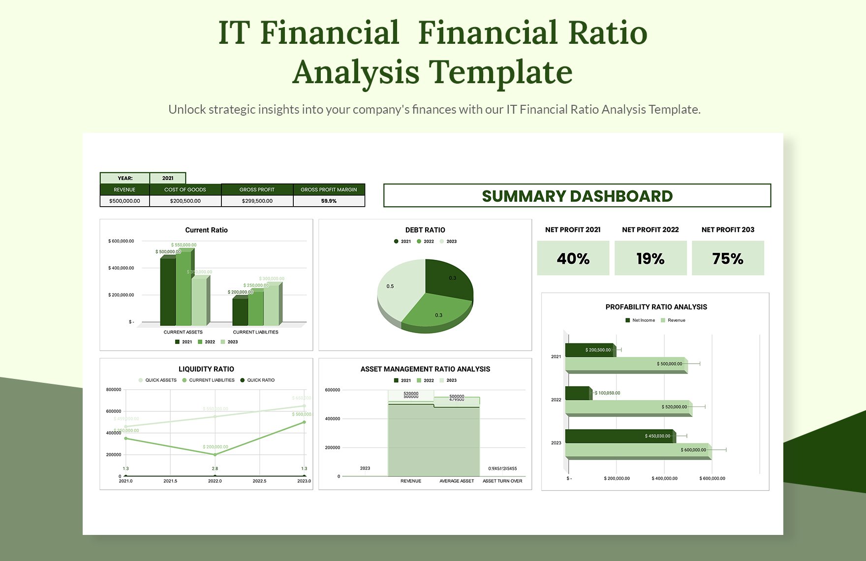
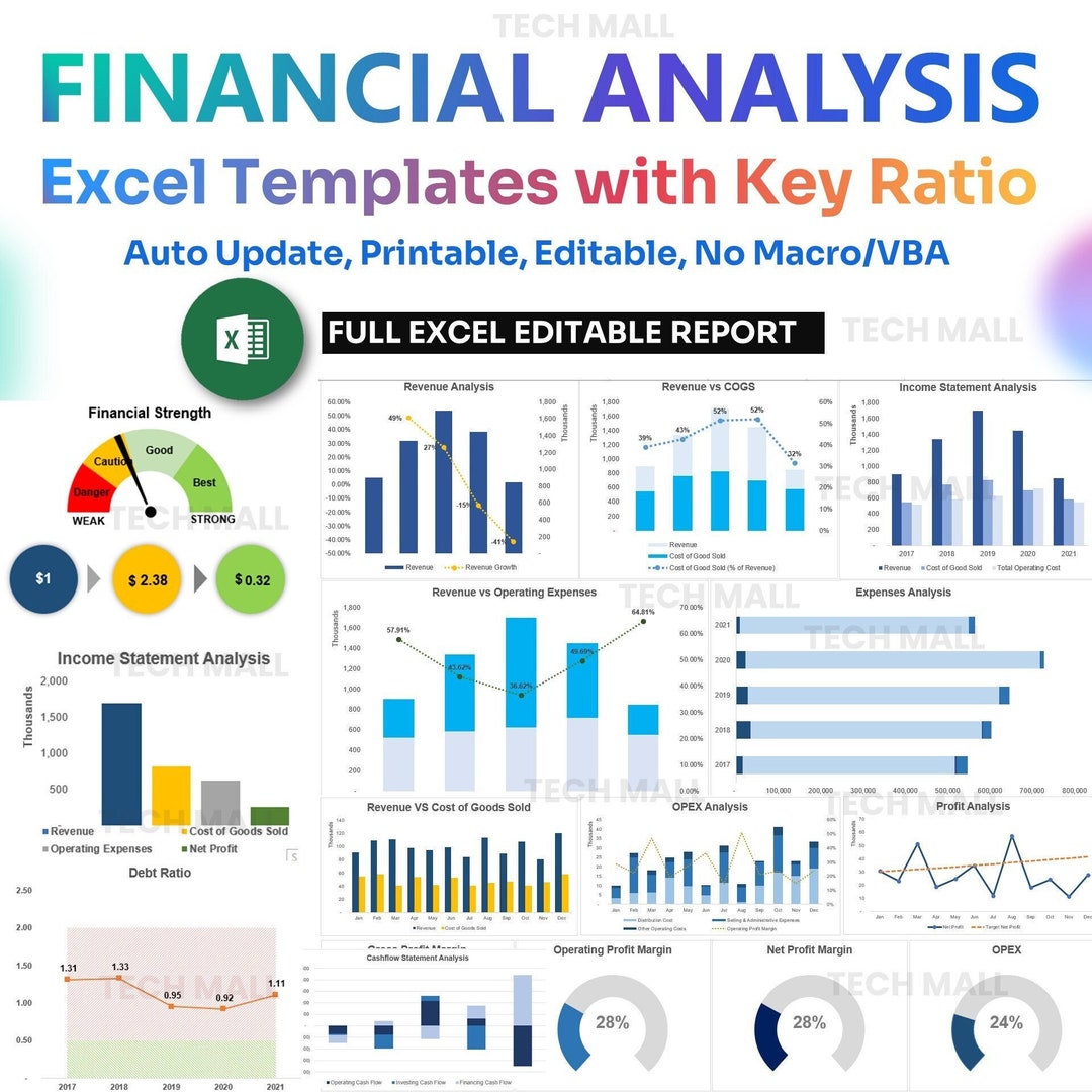
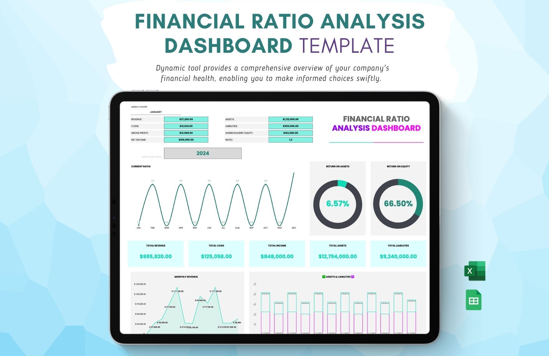
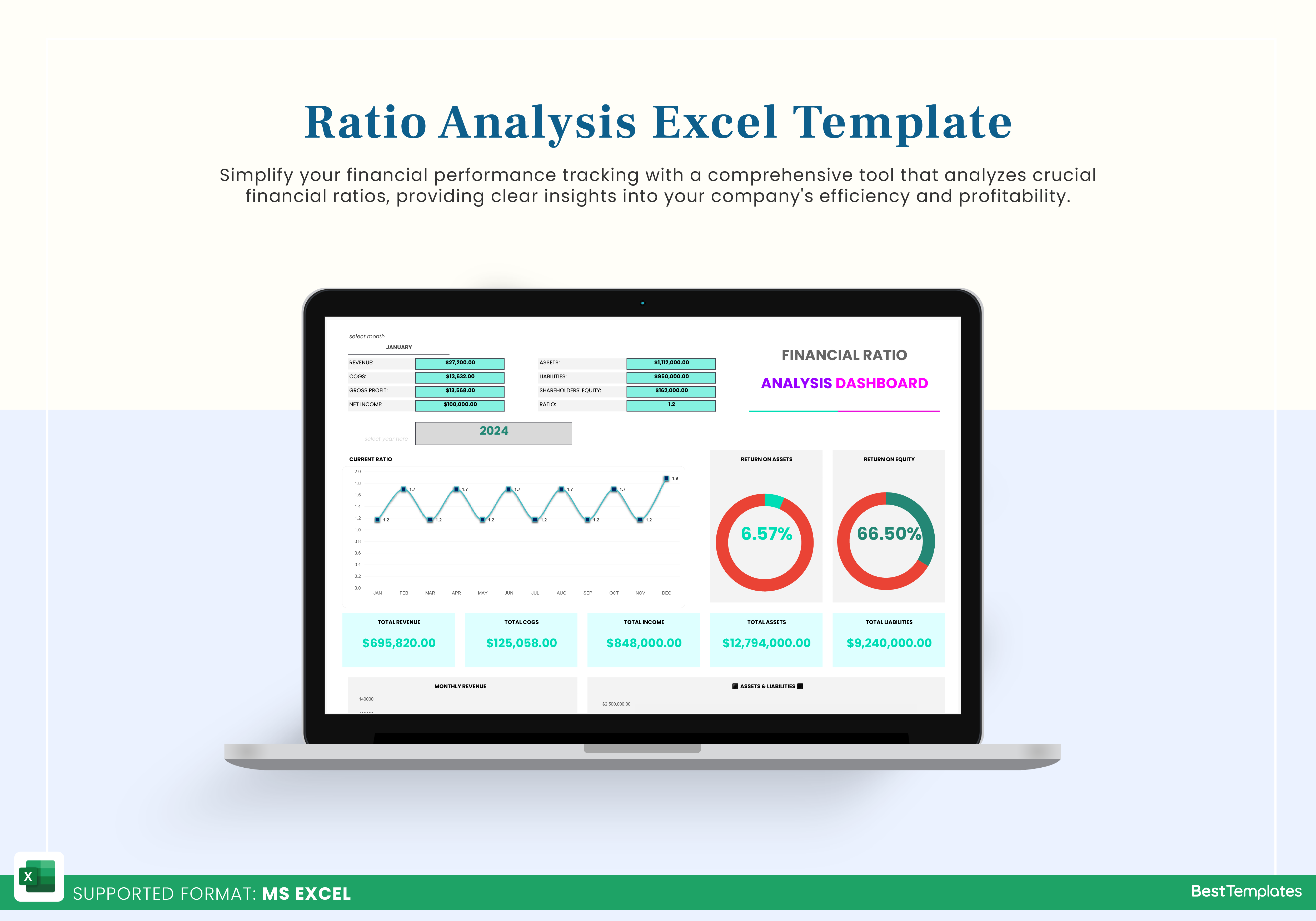
A well‑designed dashboard consolidates key ratios into a single view, often employing conditional formatting to highlight performance thresholds (green for healthy, red for concerning). Sparklines, bar charts, and waterfall graphs can illustrate trends over multiple periods, making it easier for senior management to spot emerging risks or opportunities. Interactive slicers or drop‑down lists enable users to switch between different subsidiaries, product lines, or geographic regions without altering the underlying data.
Benchmarking and Comparative Analysis
Beyond internal trends, the template should support external benchmarking against industry averages or competitor data. By importing a separate benchmark sheet and linking it to the calculation engine, you can automatically calculate variance percentages and generate visual flags where the company deviates significantly from the norm. This comparative layer is essential for strategic planning, investor presentations, and credit assessments.
Step‑by‑Step Guide to Building the Template
Step 1: Set Up the Input Structure
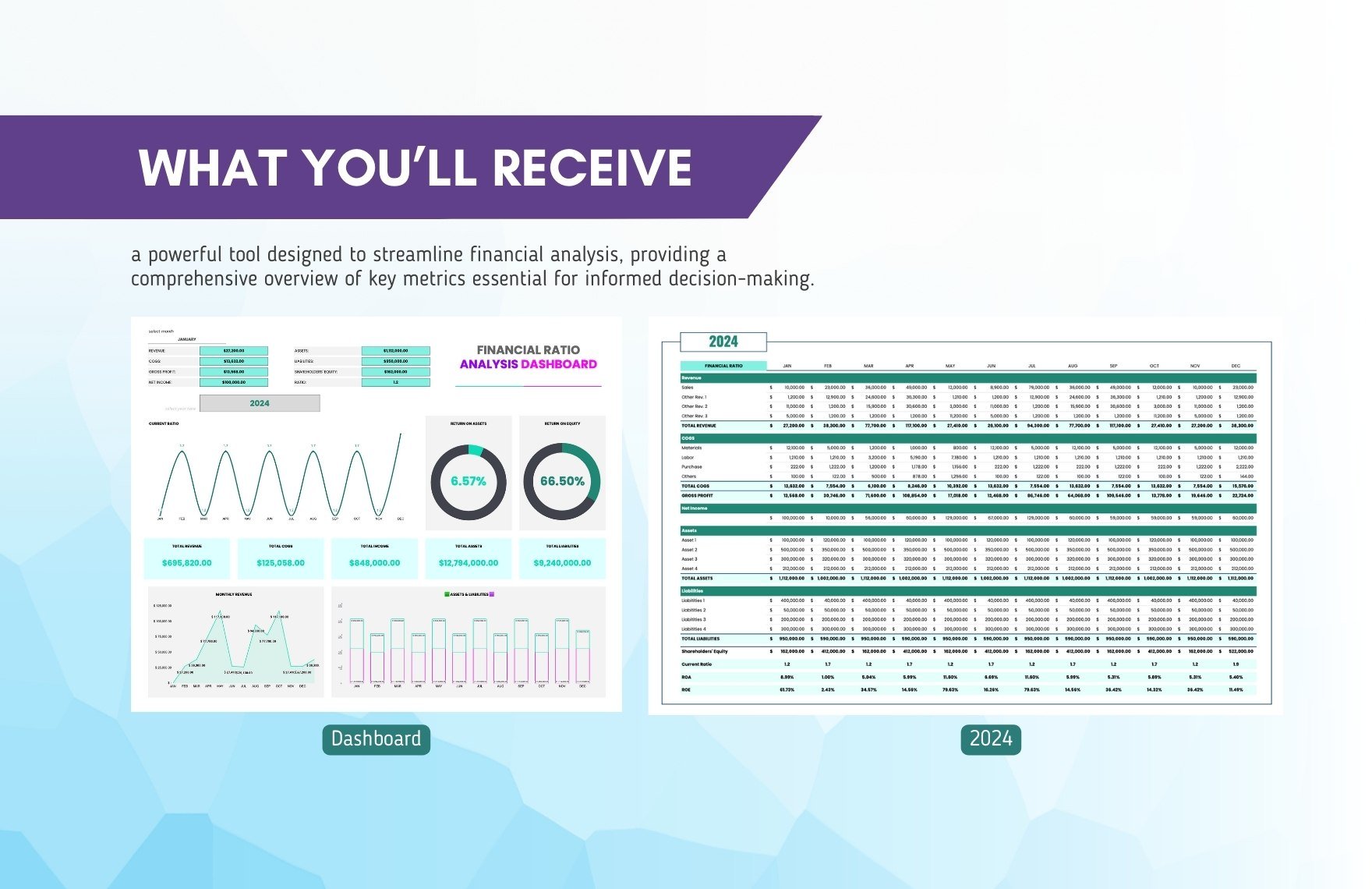
Begin by creating three worksheets named Income Statement, Balance Sheet, and Cash Flow. In each sheet, list the line items vertically in the first column—such as Revenue, Cost of Goods Sold, Net Income for the income statement, and Cash, Accounts Receivable, Inventory for the balance sheet. Across the top row, label each column with the reporting period (e.g., FY2022, FY2023). Enter historical data manually or import it from your ERP system using Excel’s Power Query feature. Ensure that numeric entries are stored as numbers, not text, to avoid calculation errors.
Step 2: Define Named Ranges
Select the range containing the total assets for the most recent period and assign it a name like TotalAssets via the Name Manager. Repeat this process for critical items such as TotalLiabilities, CurrentAssets, CurrentLiabilities, Revenue, and NetIncome. Named ranges simplify formulas and make the template more maintainable—if the layout changes, you only need to update the range definition, not every individual formula.
Step 3: Build Ratio Formulas
On a new worksheet titled Ratios, create a table with ratio names in the first column. For each ratio, write a formula that pulls from the named ranges. For example, the current ratio formula is =CurrentAssets/CurrentLiabilities. Use the IFERROR function to handle division‑by‑zero scenarios gracefully, e.g., =IFERROR(CurrentAssets/CurrentLiabilities,0). Group ratios by category, and add columns for each reporting period so that the table expands automatically as new data is added.
Step 4: Apply Conditional Formatting
Select the ratio cells and navigate to Conditional Formatting > New Rule. Set thresholds appropriate for each ratio—such as a current ratio below 1.5 turning red, between 1.5 and 2.5 turning yellow, and above 2.5 turning green. Use data bars or color scales for profitability margins to provide instant visual cues. This step transforms raw numbers into a quick‑scan health indicator for any reader.
Step 5: Create the Dashboard
Insert a new sheet named Dashboard. Use the INSERT > Chart function to plot line graphs for trends like Return on Assets (ROA) over the past five years. Add a KPI section that pulls the most recent values of key ratios using cell references. Incorporate slicers linked to a hidden table that contains the list of business units; this enables the dashboard to filter all charts and tables simultaneously. Finally, lock the dashboard sheet to prevent accidental modifications while allowing users to interact with slicers.
Step 6: Integrate Benchmark Data
Prepare a Benchmarks sheet with industry average ratios for the same periods. Use VLOOKUP or XLOOKUP to bring these benchmarks into the Ratios table, then calculate variance percentages: =(CompanyRatio-BenchmarkRatio)/BenchmarkRatio. Highlight significant variances with a separate conditional format—perhaps a bold red font for deviations exceeding 20%.
Step 7: Test and Validate
Before rolling the template out organization‑wide, perform a validation exercise. Input a known dataset where you can manually calculate a handful of ratios and compare them against the template’s results. Verify that the dashboard updates correctly when you change slicer selections or add a new fiscal year. Document any assumptions—such as the treatment of non‑recurring items—in a hidden “Assumptions” sheet for transparency.
Best Practices for Ongoing Maintenance
Version Control
Save each major iteration of the template with a clear version number and date (e.g., RatioTemplate_v2_2024.xlsx). Use a shared drive with check‑in/check‑out capabilities or a document management system to avoid conflicting edits. Maintaining a changelog within the file helps audit trails and ensures that everyone knows which version is current.
Automation Opportunities
Leverage Excel’s Power Query to pull financial statements directly from your accounting system on a scheduled basis. This reduces manual data entry and keeps the analysis up‑to‑date. For larger organizations, consider linking the template to Power BI for enterprise‑wide distribution while retaining the same calculation logic.
User Training and Documentation
Even the most intuitive template benefits from a brief user guide. Include a “Read Me” sheet that explains where to enter data, how to refresh the dashboard, and what each conditional format signifies. Conduct a short workshop for end‑users, focusing on interpreting the ratios rather than building them. This empowers stakeholders to ask the right questions and act on the insights promptly.
Real‑World Applications and Case Studies
Liquidity Management for a Manufacturing Firm
A mid‑size manufacturer used the template to monitor its current and quick ratios monthly. By setting a conditional format to flag any current ratio below 1.8, the finance team identified a cash squeeze early in Q2 2023. The dashboard’s drill‑down capability revealed that rising inventory levels were the primary cause. Management responded by renegotiating supplier terms and reducing work‑in‑process inventory, restoring the current ratio to a healthy 2.1 within two months.
Profitability Tracking in a SaaS Startup
A SaaS startup integrated subscription revenue data into the template, calculating Gross Margin, Net Margin, and Customer Acquisition Cost (CAC) payback periods. The visual dashboard highlighted a declining gross margin due to increased hosting costs. By overlaying the benchmark sheet, the startup discovered that its margin lagged behind industry averages by 12%. This insight prompted a migration to a more cost‑effective cloud provider, improving the gross margin back to the target range.
Leverage Assessment for a Real Estate Portfolio
A real estate investment trust (REIT) employed the template to track Debt‑to‑Equity and Interest Coverage ratios across its property portfolio. The conditional formatting instantly flagged two assets with Debt‑to‑Equity ratios exceeding 1.5, triggering a review of financing structures. The REIT subsequently refinanced those properties, reducing the overall leverage and enhancing the credit rating, which lowered borrowing costs.
Common Pitfalls and How to Avoid Them
Inconsistent Period Alignment
When the income statement and balance sheet cover different periods (e.g., one is quarterly, the other annually), ratio calculations become misleading. Always align periods before linking data, or create separate columns for each reporting frequency and use appropriate formulas to aggregate or disaggregate values.
Overlooking Non‑Recurring Items
Extraordinary gains or losses can distort profitability ratios. Include a separate “Adjustments” section where users can toggle the inclusion of such items. Provide a clear label—such as “Adjusted Net Income”—so that readers understand the basis of each ratio.
Neglecting Currency Effects
Multinational companies must consider exchange‑rate fluctuations. Incorporate a currency conversion table and apply it consistently across all input sheets. Document the conversion rate used for each period to maintain auditability.
Future Enhancements and Emerging Trends
Integration with AI‑Driven Forecasting
Emerging AI add‑ins for Excel can forecast future ratios based on historical trends and external variables like macroeconomic indicators. By feeding the ratio output into a predictive model, finance teams can anticipate liquidity crunches or margin erosion before they materialize.
Dynamic Scenario Planning
Using Excel’s Data Tables, you can create what‑if scenarios that automatically recalculate all ratios when key drivers—such as sales growth or cost of goods sold—are adjusted. Pair this with the dashboard slicers to visualize the impact of optimistic, base, and pessimistic cases side by side.
Cloud Collaboration and Real‑Time Updates
Hosting the template on OneDrive or SharePoint enables multiple users to edit and view the latest data simultaneously. Real‑time co‑authoring ensures that the finance department, CFO, and board members are always looking at the same numbers, eliminating version confusion.
Conclusion

The Financial Ratio Analysis In Excel Template is more than a static spreadsheet; it is a dynamic decision‑support system that transforms raw financial statements into clear, actionable intelligence. By structuring data inputs, building a robust calculation engine, visualizing results on an interactive dashboard, and incorporating benchmarking, you empower stakeholders at every level to make informed, timely choices. Adhering to best practices—such as version control, automation, and thorough documentation—ensures the model remains accurate and adaptable as your business evolves. Whether you are monitoring liquidity for a manufacturing plant, tracking profitability for a SaaS venture, or assessing leverage across a real‑estate portfolio, a well‑crafted Excel template delivers the speed, flexibility, and insight needed to stay ahead in today’s fast‑paced financial environment.