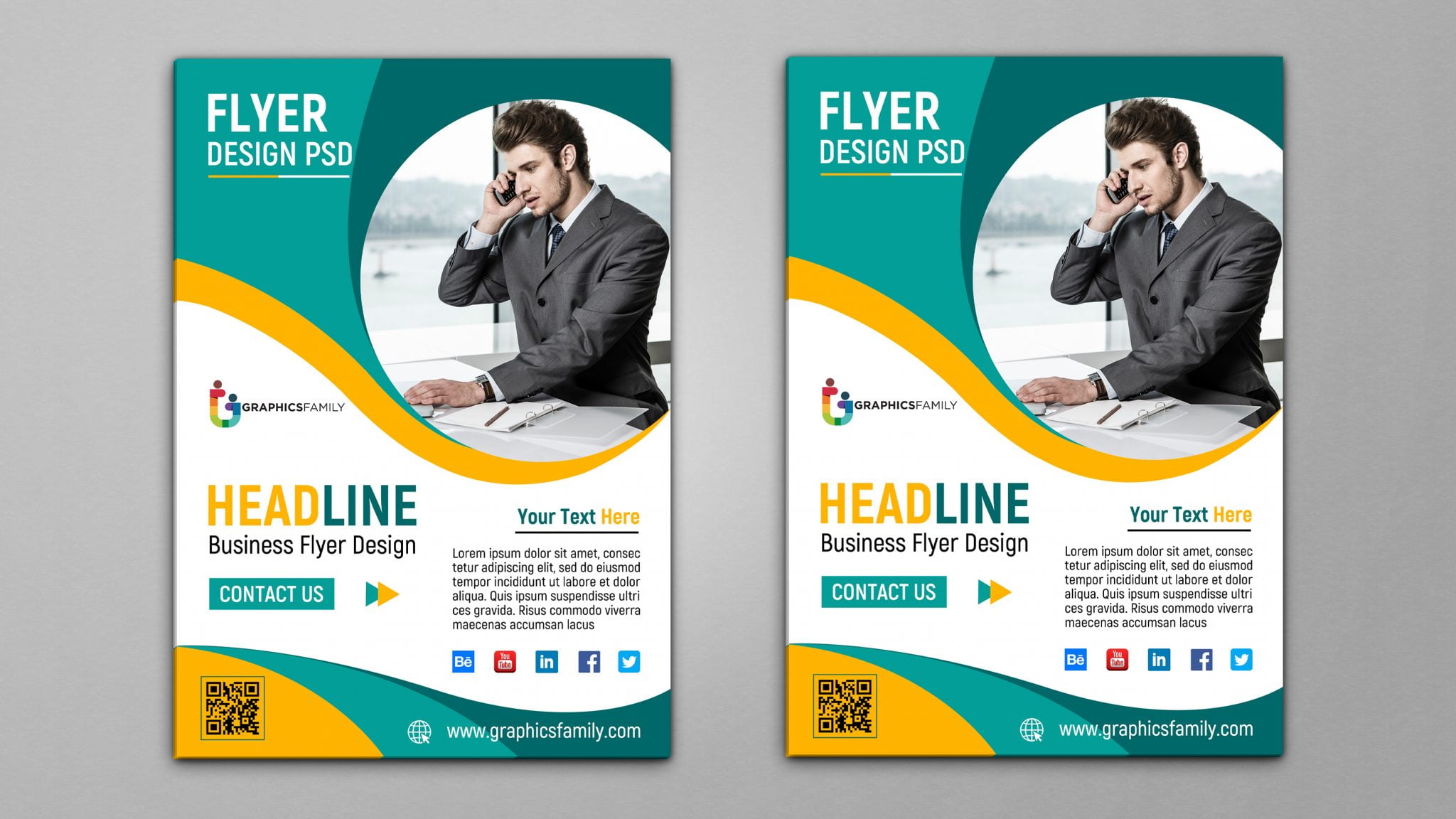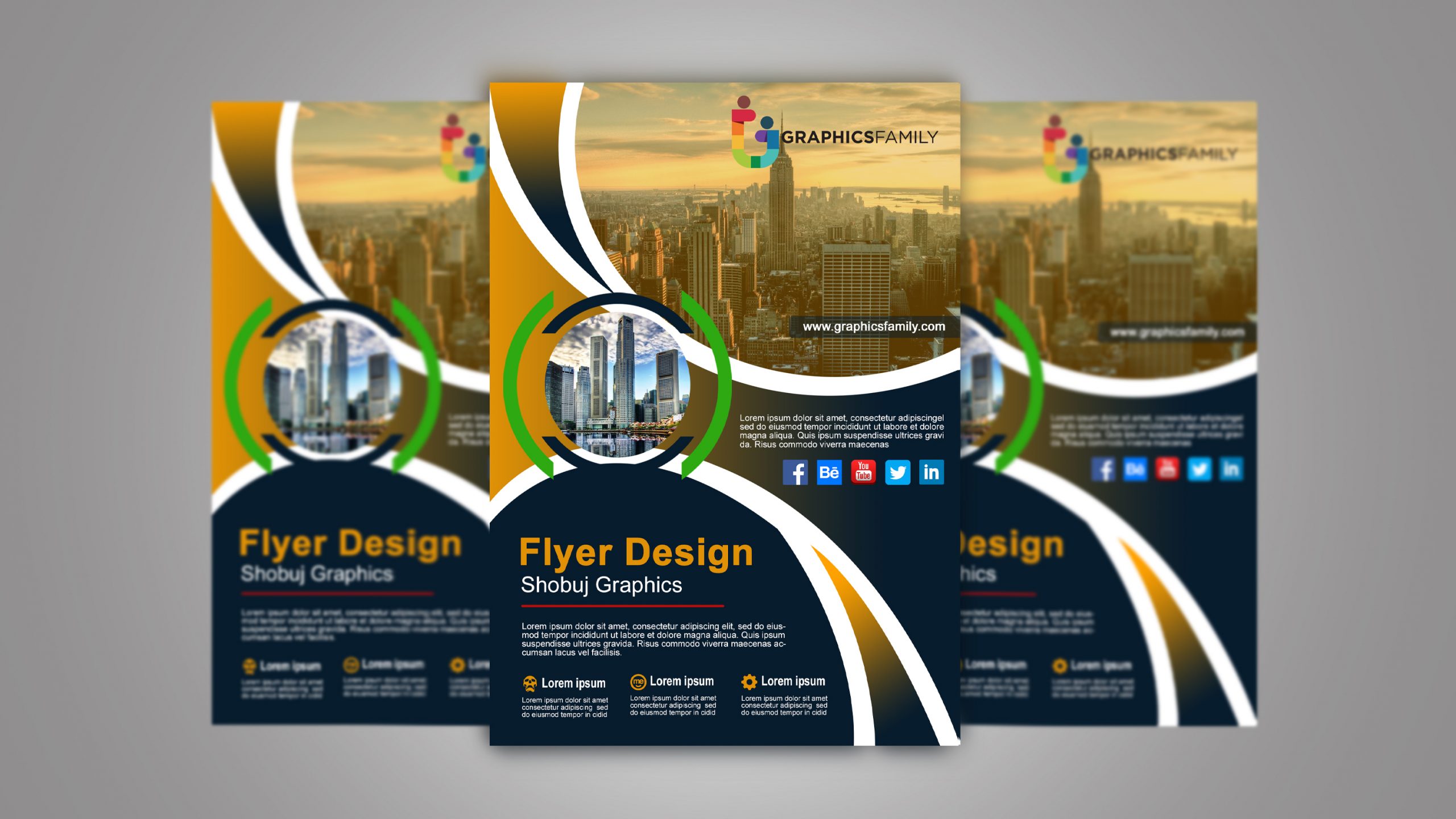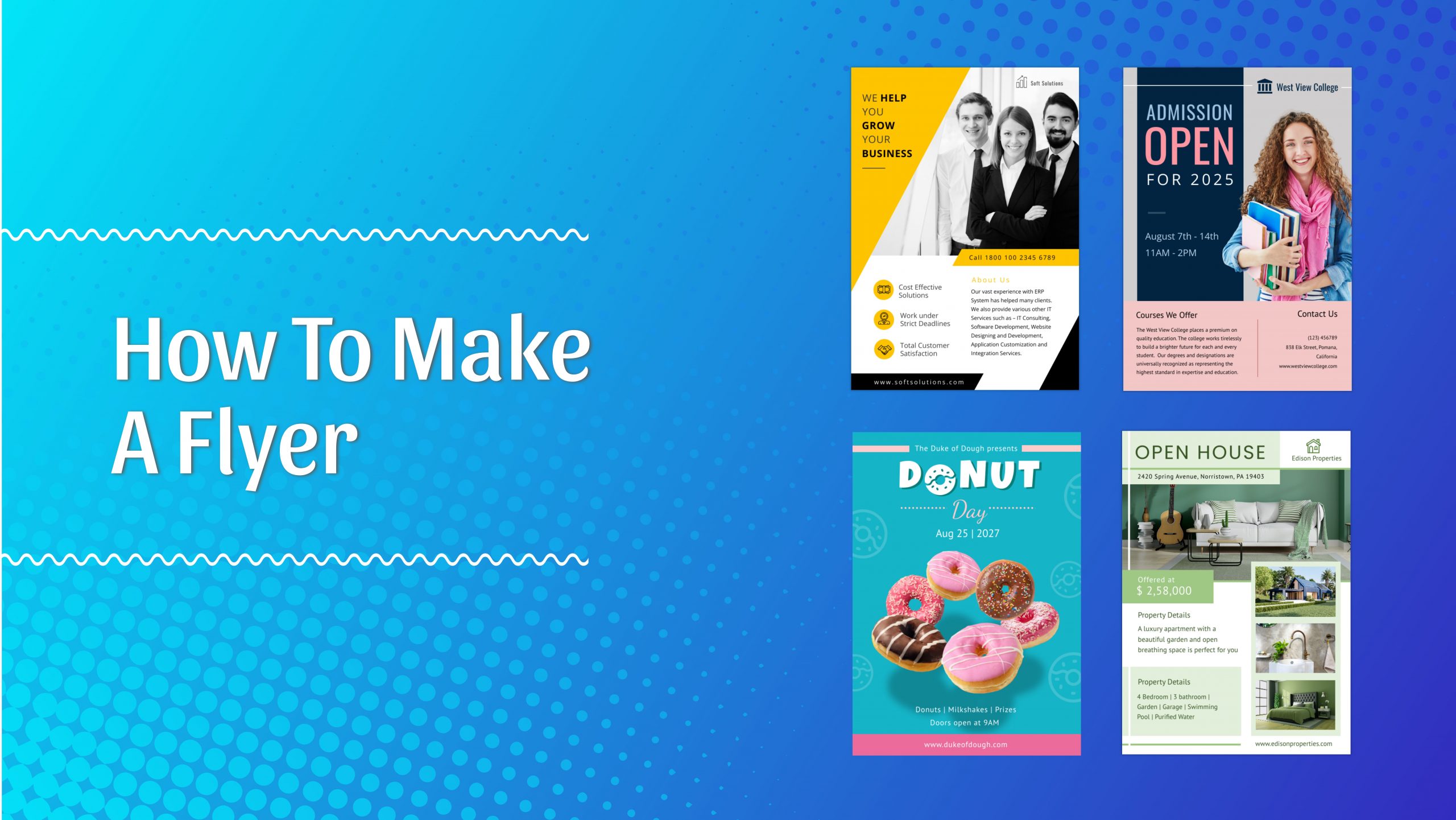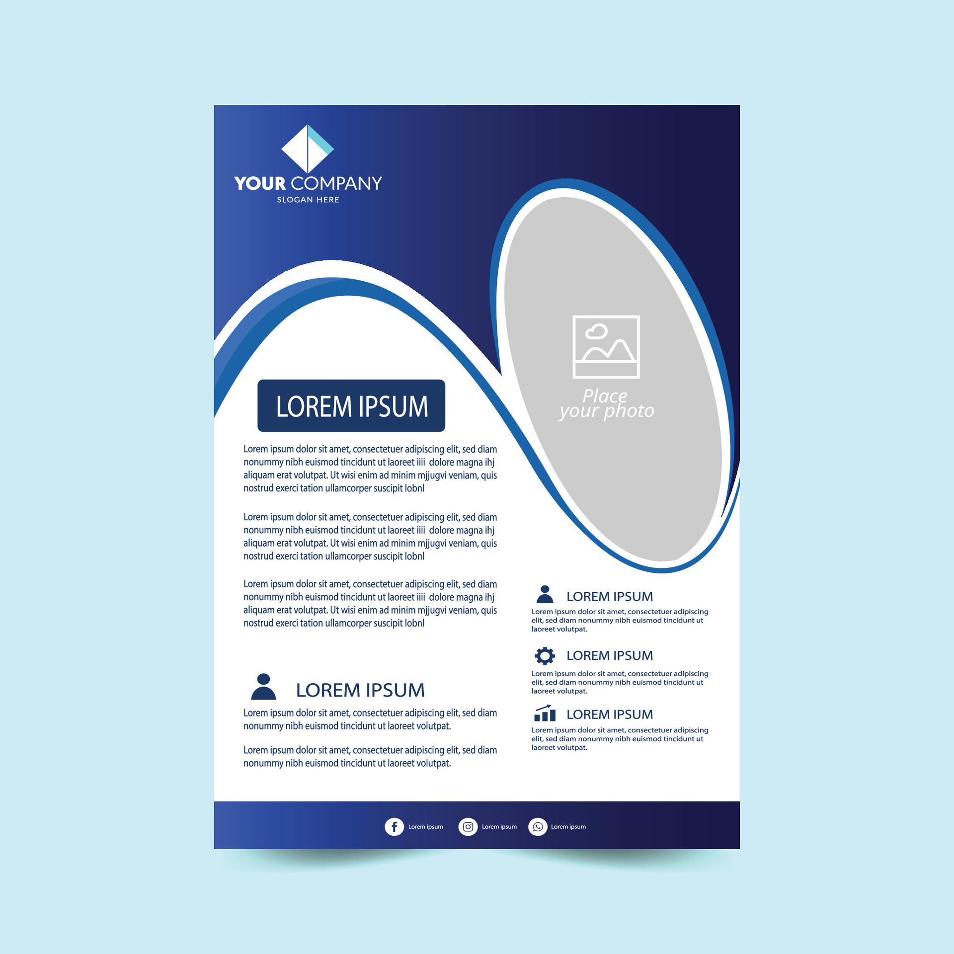
Make Flyer Template projects a powerful visual statement for any business, event, or cause, and mastering the art of creating one can dramatically boost brand visibility and audience engagement. In today’s fast‑paced digital marketplace, a well‑crafted flyer serves as both a tactile reminder and a shareable online asset, bridging the gap between traditional print marketing and modern social media outreach. This guide walks you through every critical step—from concept development to final export—ensuring you produce a flyer template that is not only aesthetically compelling but also strategically aligned with your marketing objectives.
Understanding the Purpose of a Flyer Template
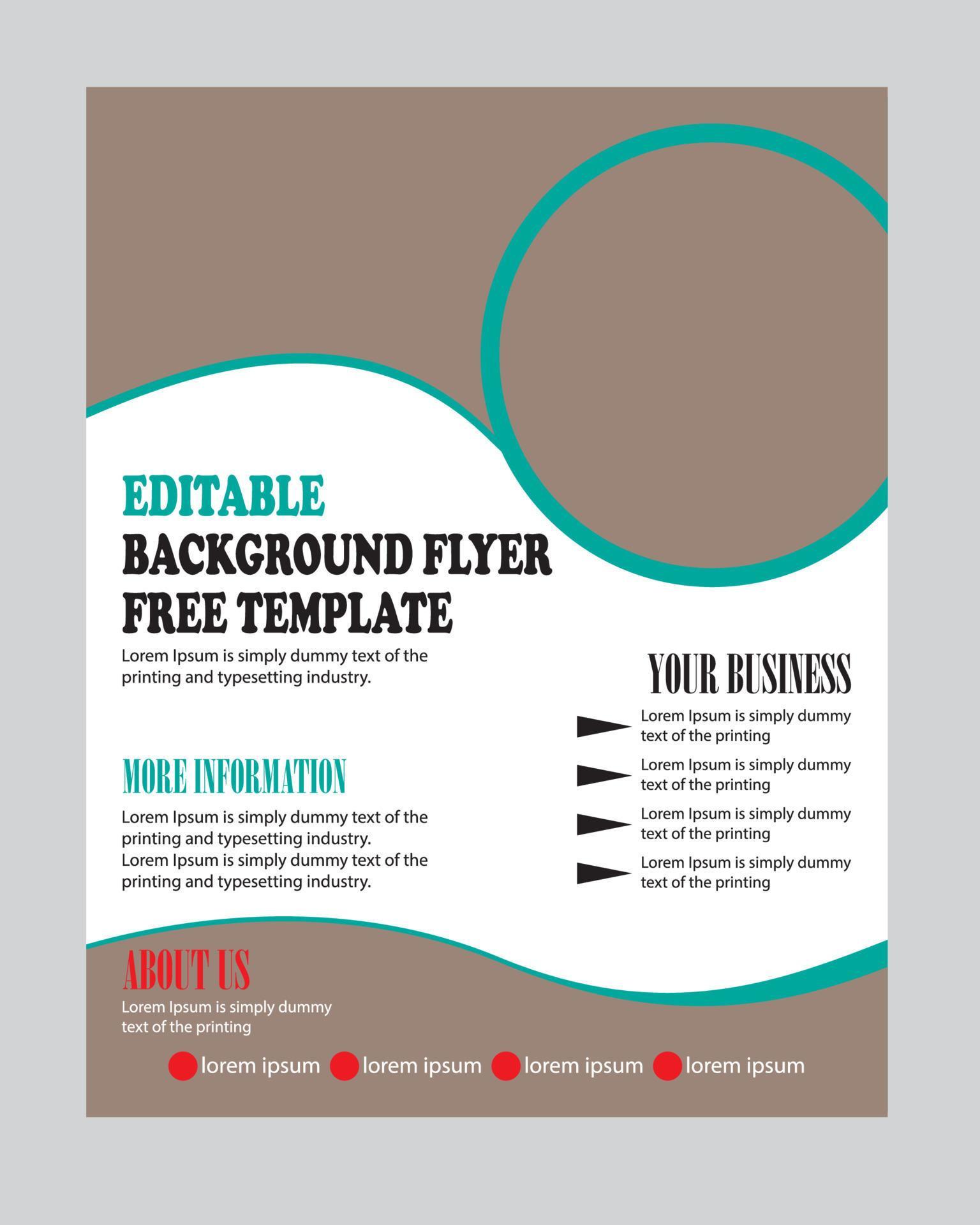
A flyer template is more than a blank canvas; it is a reusable framework that encapsulates your brand’s visual language, messaging hierarchy, and call‑to‑action (CTA) structure. By establishing a consistent template, you streamline production, maintain brand cohesion across multiple campaigns, and reduce the time required for future design iterations. Before you open any design software, clarify the specific goals your flyer aims to achieve.
Defining Your Target Audience
Identify the demographic profile—age, gender, interests, and purchasing behavior—of the people you want to reach. A flyer aimed at college students will differ dramatically in tone, imagery, and layout compared to one targeting senior professionals. Conduct brief audience research, such as surveys or social media listening, to uncover language preferences and visual triggers that resonate with your intended recipients.
Establishing Core Messaging
Every flyer must convey a singular, compelling message. Draft a concise headline that captures attention within five seconds, followed by supporting copy that highlights benefits, offers, or event details. Prioritize information hierarchy: the headline, the key benefit or offer, date/time or price, and a clear CTA. This hierarchy will guide the visual arrangement of elements within your template.
Choosing the Right Design Tools
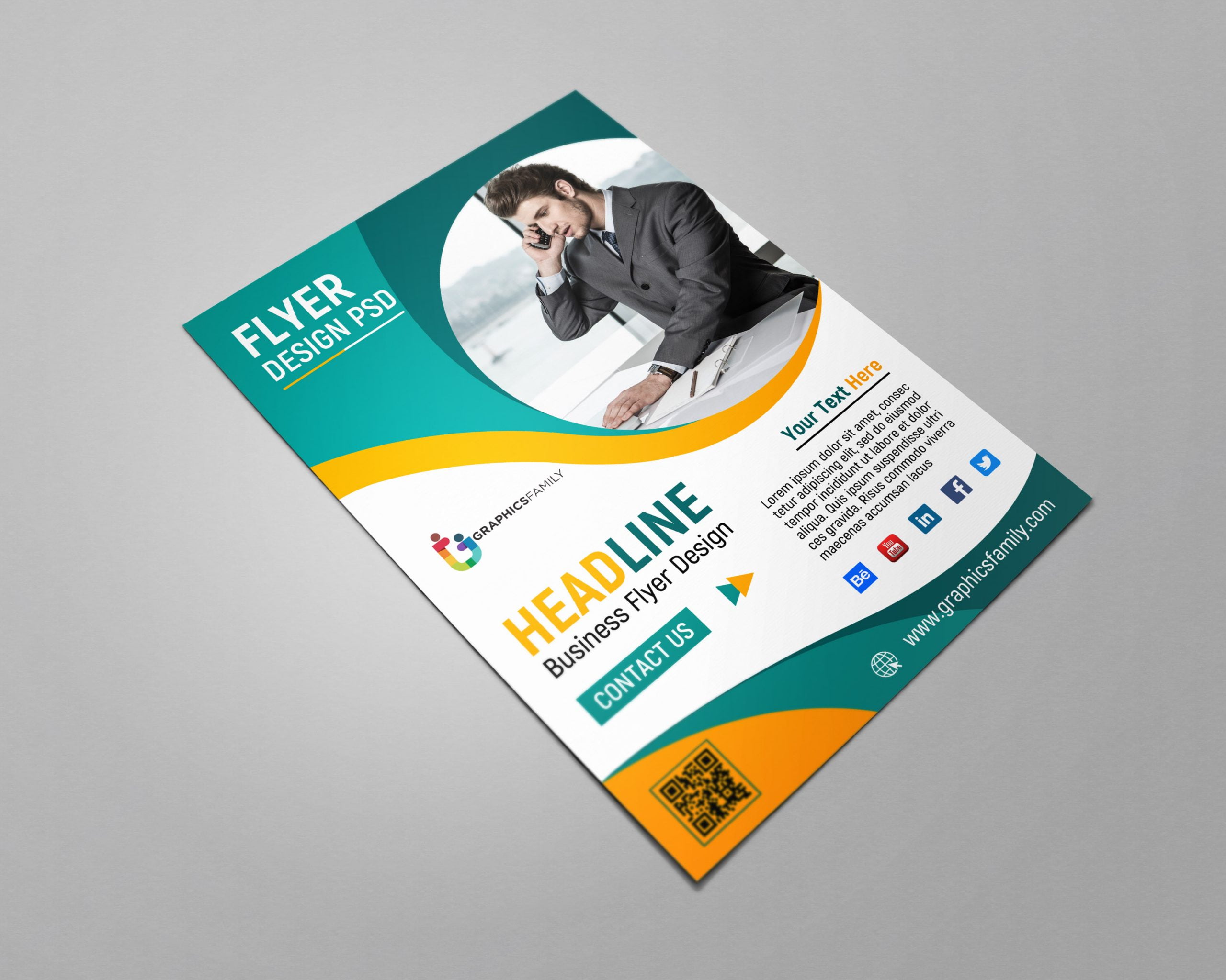
Professional designers often rely on industry‑standard applications such as Adobe InDesign, Illustrator, or Photoshop, while small businesses may prefer user‑friendly platforms like Canva or Affinity Designer. Regardless of the tool, ensure it supports high‑resolution output (300 dpi for print) and vector‑based graphics for scalability.
Software Features to Prioritize
- Layer Management: Allows you to separate text, images, and background elements, making edits painless.
- Master Pages or Symbols: Facilitates consistent placement of logos, footers, and recurring design elements across multiple flyer versions.
- Export Options: Look for PDF/X‑1a compliance for print, and JPEG/PNG options for digital sharing.
Hardware Considerations
While a powerful laptop or desktop enhances workflow speed, the most critical hardware factor is color accuracy. Invest in a calibrated monitor to ensure on‑screen colors match the final printed output, especially when using brand‑specific Pantone shades.
Design Foundations: Layout, Typography, and Color
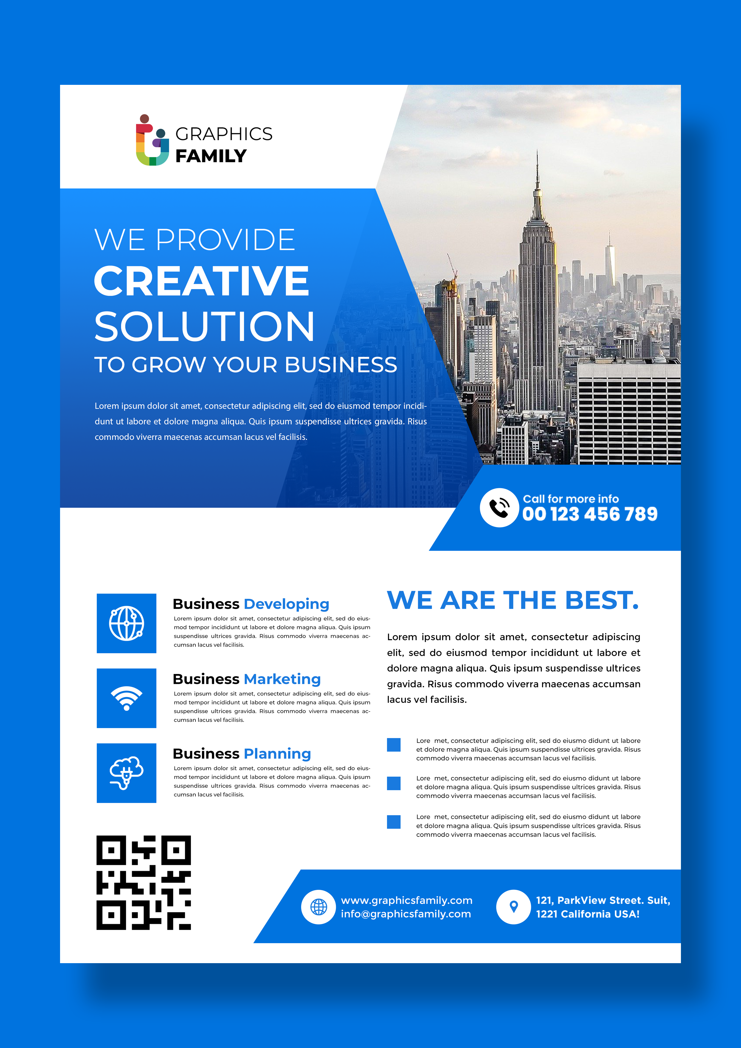
A solid foundation prevents design fatigue and ensures readability across different distribution channels. Follow proven design principles to create a balanced and engaging flyer template.
Grid Systems and Alignment
Adopt a modular grid—commonly a 3‑column or 4‑column structure—to organize content logically. Align text blocks, images, and icons to the grid lines, which creates visual harmony and guides the viewer’s eye through the information hierarchy.
Typography Selection
Choose no more than two typefaces: a bold, attention‑grabbing font for headings and a clean, legible font for body copy. Maintain consistent font sizes for similar content types (e.g., all subheadings at 24 pt, body text at 12 pt). Use proper line spacing (1.4 to 1.6) to improve readability, and avoid all‑caps paragraphs except for brief headlines.
Color Theory and Brand Consistency
Leverage your brand’s primary palette for dominant elements like background or headline text, while using complementary accent colors to highlight offers or CTAs. Apply the 60‑30‑10 rule: 60 % dominant color, 30 % secondary color, and 10 % accent. Ensure sufficient contrast between text and background to meet accessibility standards (WCAG AA minimum contrast ratio of 4.5:1).
Incorporating Visual Assets Effectively
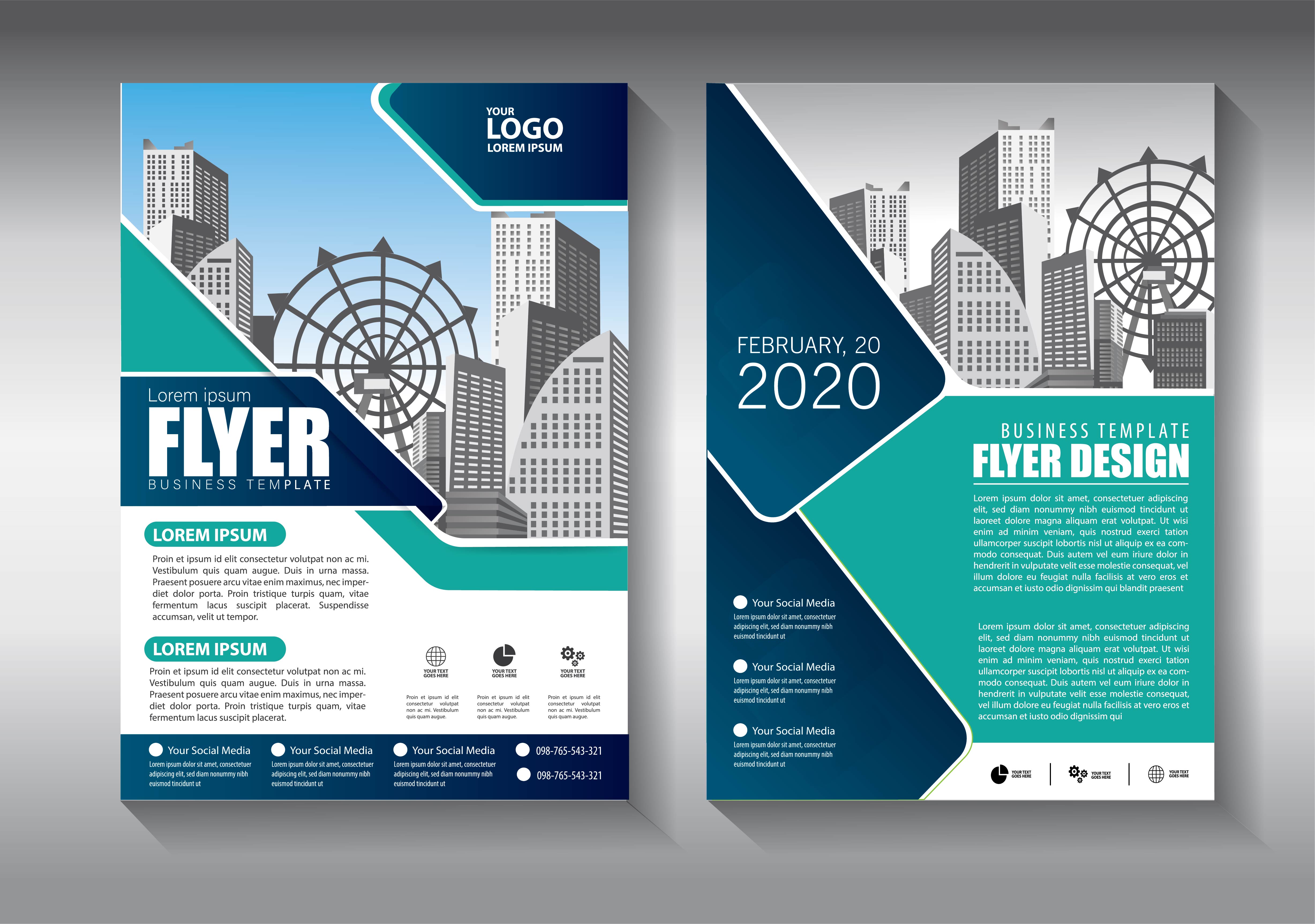
Images, icons, and illustrations bring life to a flyer but must be used purposefully. Low‑quality visuals can undermine credibility, while well‑chosen assets reinforce your message.
Sourcing High‑Resolution Images
Use royalty‑free stock photography that aligns with your brand’s tone. Opt for images with a minimum resolution of 300 dpi for print. Crop and adjust exposure to match the flyer’s color palette, and apply subtle overlays if needed to enhance text legibility.
Iconography and Illustrations
Icons simplify complex information and guide the viewer’s navigation. Choose a consistent icon style—line, flat, or glyph—and limit the set to five icons maximum to avoid visual clutter. Use vector formats (SVG or AI) for crisp scaling.
Balancing Visual Weight
Distribute visual weight evenly across the layout. A large image on one side should be balanced by text blocks or smaller graphics on the opposite side. This equilibrium prevents the flyer from feeling lopsided and encourages natural eye movement.
Crafting Compelling Copy
Even the most stunning visuals fall flat without persuasive copy. Your wording should be concise, benefit‑focused, and action‑oriented.
Headline Formulas
- Ask a question that addresses a pain point: “Ready to Boost Your Sales by 30%?”
- Offer a clear benefit: “Save $50 on All Services This Weekend.”
- Create urgency: “Limited Seats – Register Today!”
Body Copy Best Practices
Use short sentences and bullet points to convey details quickly. Highlight unique selling propositions (USPs) with bold or italic styling, but sparingly—no more than two instances per paragraph—to maintain emphasis without overwhelming the reader.
Call‑to‑Action Optimization
A strong CTA tells the audience exactly what to do next. Use action verbs (“Download,” “Call,” “Visit”) and incorporate a sense of immediacy (“Now,” “Today”). Place the CTA in a visually distinct button or highlighted box, and repeat it at both the top and bottom of the flyer for reinforcement.
Building the Template in Your Chosen Software
Now that you have your design foundations, it’s time to assemble the template step by step. Below is a generic workflow applicable to most design tools.
Step 1: Set Up Document Settings
Open a new document with the final flyer dimensions—commonly 8.5 × 11 in (letter) or A5 (148 × 210 mm). Set the color mode to CMYK for print or RGB for digital distribution. Add a 0.125 in bleed on all sides to prevent white edges after trimming.
Step 2: Create Master Layers
Establish separate layers for background, imagery, text, and guides. Lock the background layer after adding a solid color or subtle texture, ensuring it remains untouched while you work on other elements.
Step 3: Build the Grid
Insert vertical and horizontal guides to form a 3‑column grid with generous margins (0.5 in). Enable snapping to keep elements aligned precisely to the grid lines.
Step 4: Insert Visual Elements
Place your chosen hero image in the top third of the flyer, using a clipping mask if necessary to fit the grid. Add supporting icons near bullet points to visually break up text. Apply consistent opacity or color overlays to unify the visual language.
Step 5: Add Textual Content
Using the headline font, type the main headline, ensuring it spans no more than two lines. Below it, insert a subheadline that reinforces the benefit. For body copy, use the secondary font, aligning paragraphs left for readability. Highlight key phrases with bold or italic emphasis where appropriate.
Step 6: Design the CTA Button
Draw a rectangular shape, fill it with your accent color, and round the corners slightly for a modern look. Center the CTA text inside, using a contrasting color for readability. Apply a subtle drop shadow to make the button pop.
Step 7: Apply Branding Elements
Place your logo in the top left or bottom right corner, maintaining a clear space buffer equal to the height of the logo. Include any mandatory legal or disclaimer text in the footer, using a small but legible font size (8‑pt).
Step 8: Review and Refine
Zoom to 100 % and examine every element for alignment, spelling errors, and color consistency. Conduct a print preview to ensure that bleed areas are correctly set and that no critical information sits too close to the edge.
Optimizing for Print and Digital Distribution

Different channels demand specific file formats and specifications. Preparing separate assets for each ensures your flyer looks flawless whether printed on glossy paper or shared on social media.
Print-Ready Export Settings
- File Format: PDF/X‑1a or high‑resolution PDF.
- Resolution: 300 dpi for images and raster effects.
- Color Profile: CMYK with appropriate ICC profiles for the chosen paper stock.
- Bleed and Crop Marks: Include 0.125 in bleed and printer’s crop marks.
Digital Export Settings
- File Format: JPEG (maximum 90 % quality) or PNG for transparent backgrounds.
- Resolution: 72 dpi for web, but consider 150 dpi if the flyer will be viewed on high‑resolution screens.
- Color Profile: RGB (sRGB IEC61966‑2.1) for consistent display across devices.
- File Size: Keep under 2 MB for email attachments and social media uploads.
Testing and Gathering Feedback
Before finalizing the flyer template, gather input from stakeholders and a sample of your target audience. This iterative process helps catch design oversights and refines messaging for maximum impact.
Internal Review Checklist
- Brand Consistency: Does the flyer match existing brand guidelines?
- Readability: Are fonts legible at typical viewing distances?
- Visual Hierarchy: Does the eye naturally flow from headline to CTA?
- Technical Accuracy: Are all dates, times, URLs, and contact details correct?
User Testing Methods
Conduct a quick A/B test by presenting two variations of the flyer to a small focus group. Measure which version generates higher recall or stronger intent to act. Use the feedback to adjust color contrast, copy tone, or CTA placement.
Maintaining and Updating Your Flyer Template
A template’s true value lies in its reusability. Establish a systematic approach for future updates to keep the flyer fresh without redesigning from scratch.
Version Control Practices
Save each iteration with a clear naming convention (e.g., “FlyerTemplate_V1.0.ai”). Archive older versions in a dedicated folder, and maintain a changelog documenting alterations to text, imagery, or branding.
Template Customization Tips
- Swap hero images while retaining layout and typography.
- Adjust color accents for seasonal campaigns (e.g., red for holidays, teal for spring).
- Replace CTA text to reflect different offers without moving underlying elements.
Automation Options
If you produce flyers regularly, explore data‑merge features in InDesign or use spreadsheet‑driven variables to populate event details automatically. This reduces manual entry errors and accelerates turnaround time.
Measuring the Success of Your Flyer Campaign
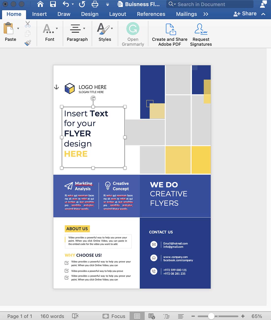
Quantifying results validates the effort invested in creating a high‑quality flyer template. Track both offline and online metrics to gain a comprehensive view of performance.
Offline Metrics
- Response Rate: Count the number of phone calls, email inquiries, or walk‑ins generated from the flyer distribution.
- Redemption Rate: Measure how many recipients use a printed coupon or discount code.
- Distribution Reach: Record the number of flyers handed out, mailed, or placed in strategic locations.
Online Metrics
- QR Code Scans: If you embed a QR code, monitor scan counts via a URL shortener or analytics platform.
- Landing Page Visits: Use UTM parameters to attribute web traffic directly to the flyer.
- Social Shares: Encourage recipients to share a digital version and track shares or hashtags.
Common Pitfalls and How to Avoid Them
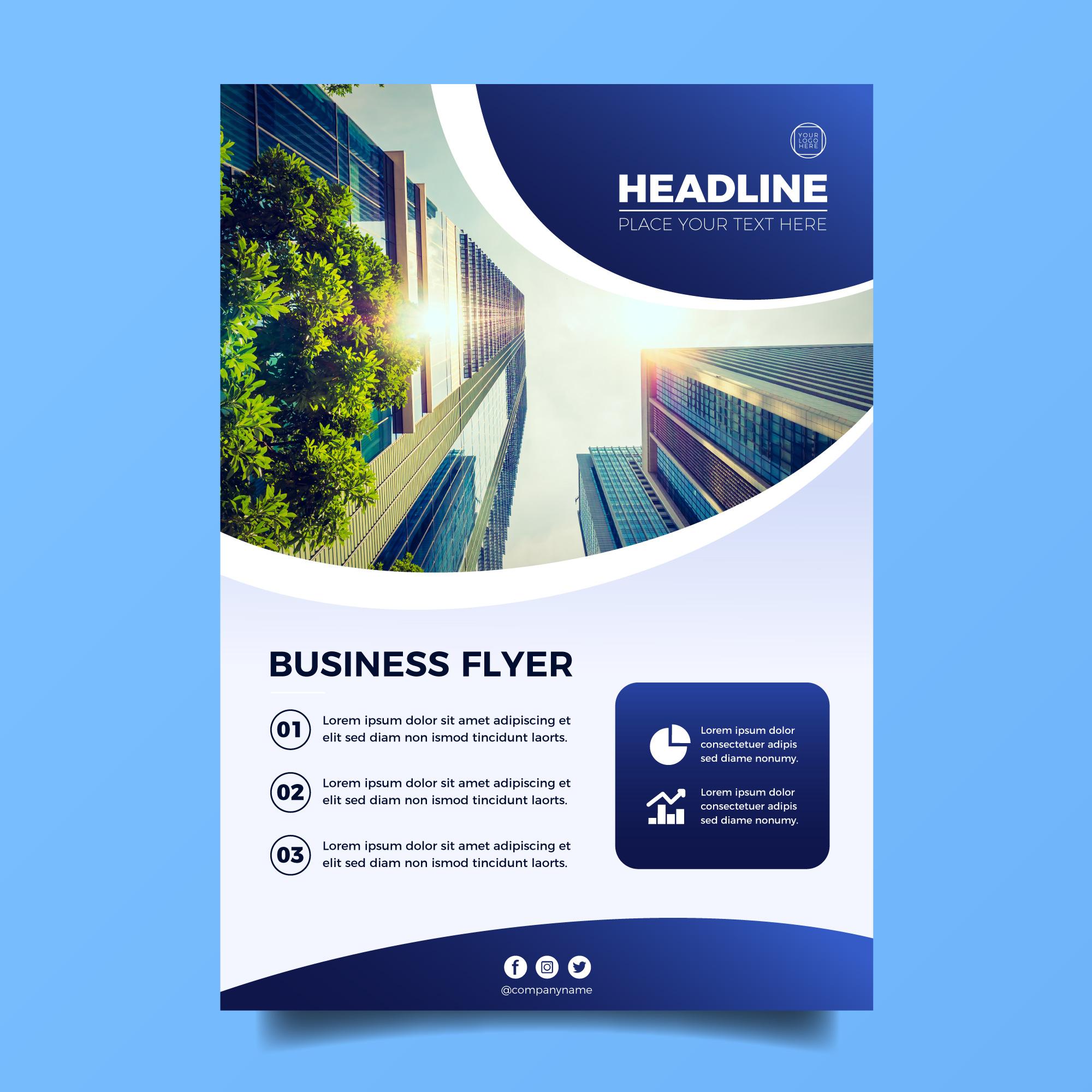
Even experienced designers can fall into traps that diminish a flyer’s effectiveness. Recognizing these pitfalls early helps you produce a flawless template.
Overcrowding the Layout
Resist the urge to include every piece of information. Prioritize essential details and leave ample white space to let each element breathe.
Poor Contrast and Legibility
Always test text against the background under different lighting conditions. If the contrast falls below the recommended ratio, adjust color choices or add a subtle text background.
Ignoring Print Specifications
Failing to account for bleed, safe zones, or color profiles can lead to costly reprints. Double‑check printer requirements before exporting the final file.
Inconsistent Branding
Using unauthorized fonts, colors, or logo variations confuses the audience and weakens brand recall. Keep a brand style guide handy while designing.
Conclusion

Creating a Make Flyer Template that consistently delivers results involves strategic planning, disciplined design fundamentals, and rigorous testing. By defining your audience, establishing a clear message hierarchy, and adhering to best‑practice layout, typography, and color principles, you lay a solid foundation for any flyer project. Leveraging the right tools, optimizing assets for both print and digital channels, and instituting a systematic update process ensure that your template remains a versatile asset for future campaigns. Finally, measuring performance and learning from each distribution round empowers you to refine your approach continuously, turning each flyer into a powerful catalyst for brand growth and audience engagement.