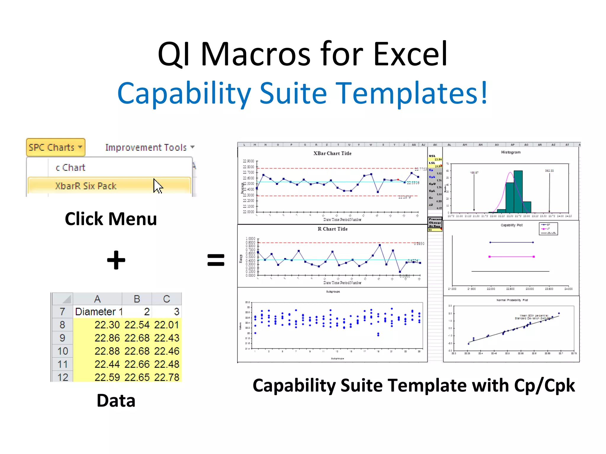
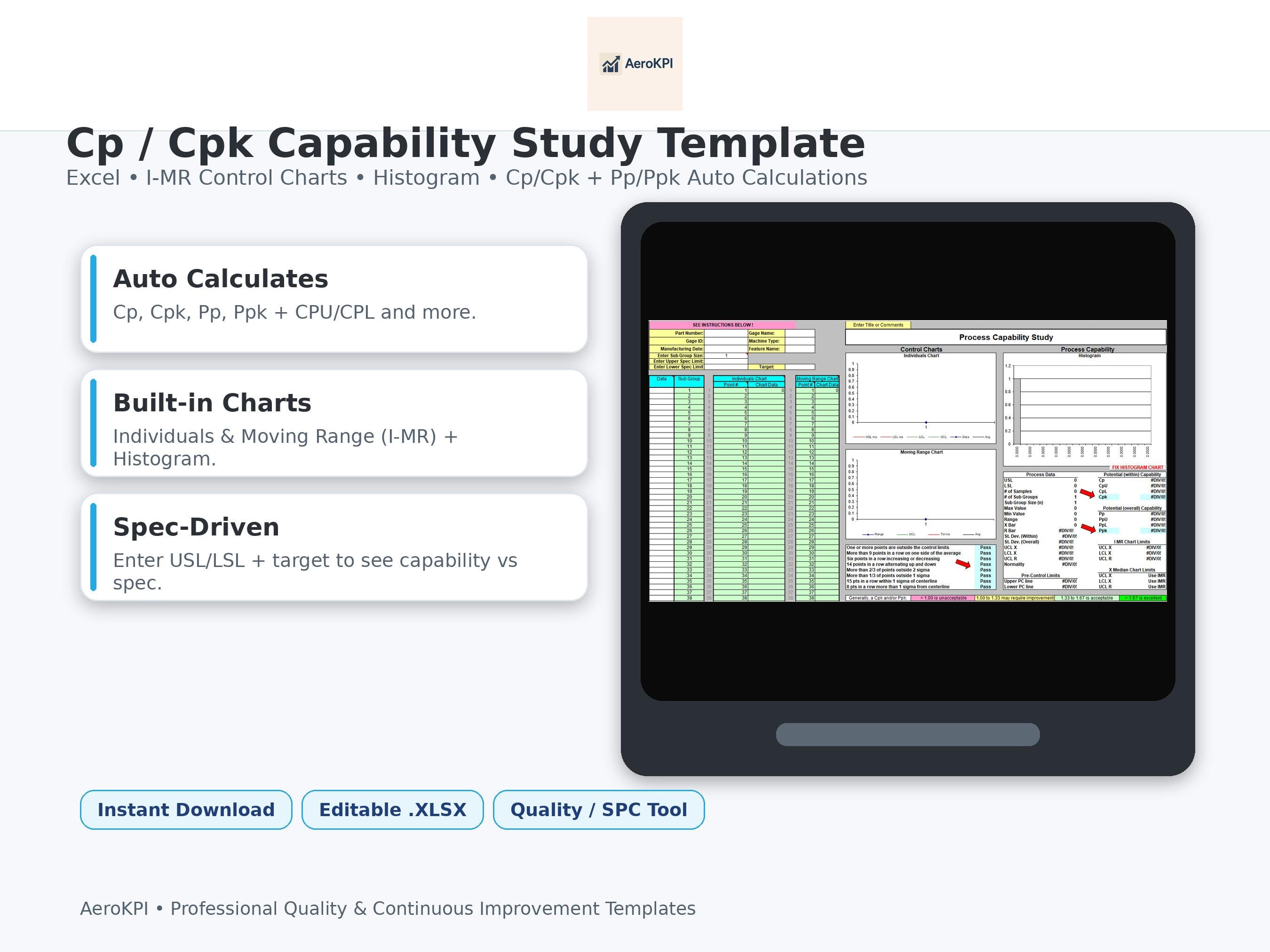
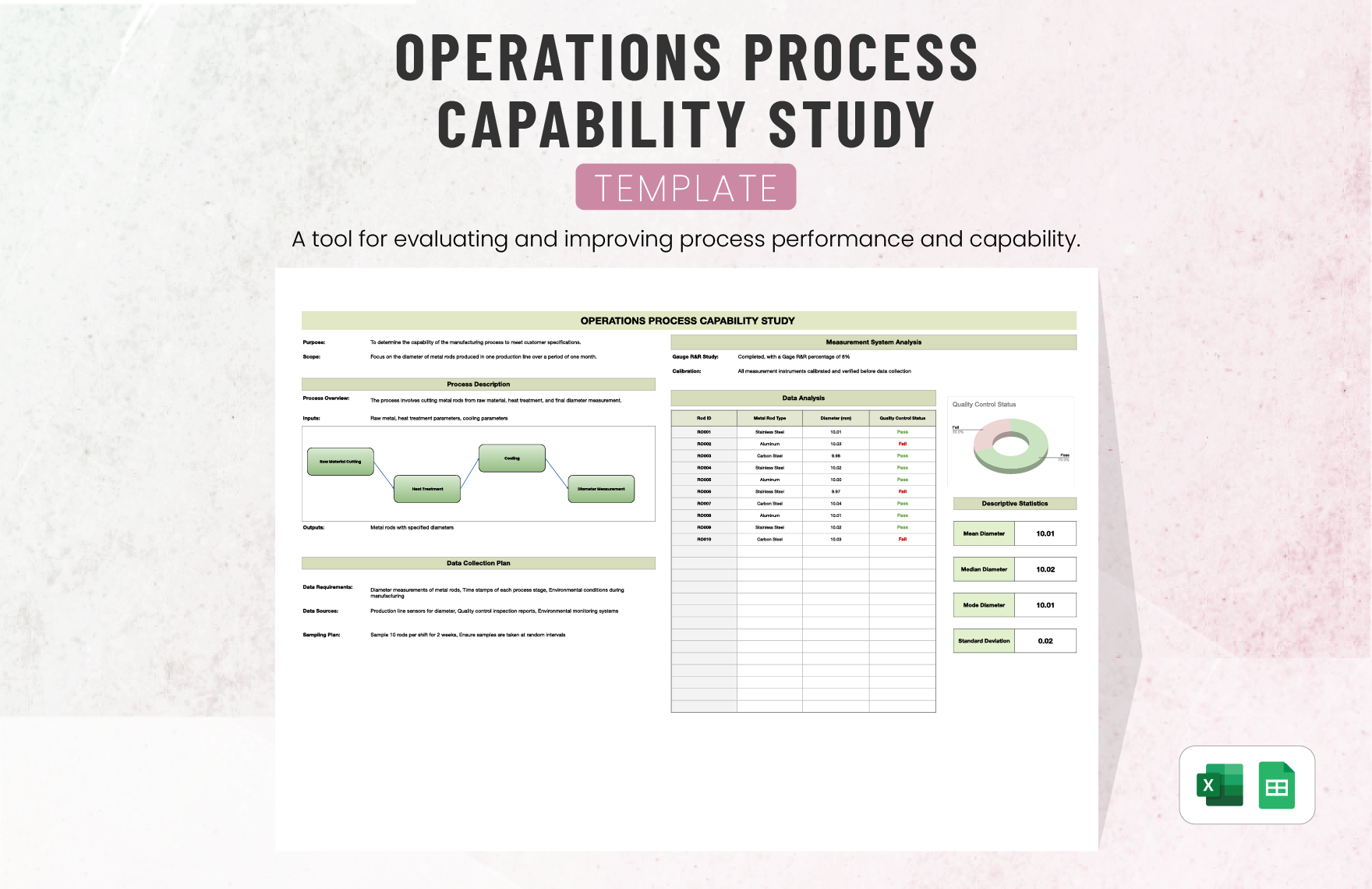
Process Capability Analysis Excel Template is like the Swiss Army knife of quality engineering—only instead of a screwdriver and a cheese grater, it gives you statistical insights and a spreadsheet that can make your boss say, “Wow, this is Excel-lent!”
What Is Process Capability?
Process capability is the measure of how well a manufacturing process can produce parts that meet specifications. Think of it as a gym membership for your production line: you’re checking whether your process can consistently hit the target weight (the spec limits) without overtraining (going out of bounds). The most common metrics are Cp, Cpk, and Ppk, but don’t worry—those letters won’t turn into a cryptic crossword for you.
Key Terminology Explained
- Cp (Process Capability Index) compares the width of the process spread to the spec limits.
- Cpk (Process Capability Index, centered) penalizes the process when it’s off-center.
- Ppk (Process Performance Index) is the same as Cpk but calculated from long-term data.
In layman’s terms: higher values mean your process is tighter, more reliable, and less likely to produce a defect.
Why You Need It
Imagine a coffee shop that serves latte art with the precision of a NASA launch—every cup looks exactly the same. That’s process capability in action. Without it, you’ll end up with a chaotic kitchen, customers waving their mugs, and a quality team that can’t sleep at night.
Meet the Excel Template: Your New Best Friend
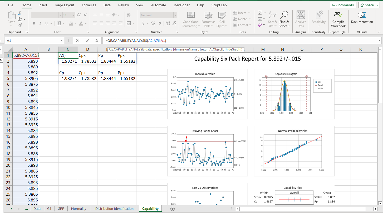
Let’s break down how this template transforms raw data into meaningful insights—and maybe, just maybe, gives your spreadsheet a personality.
Getting Started
Open the template in Excel and follow these simple steps:
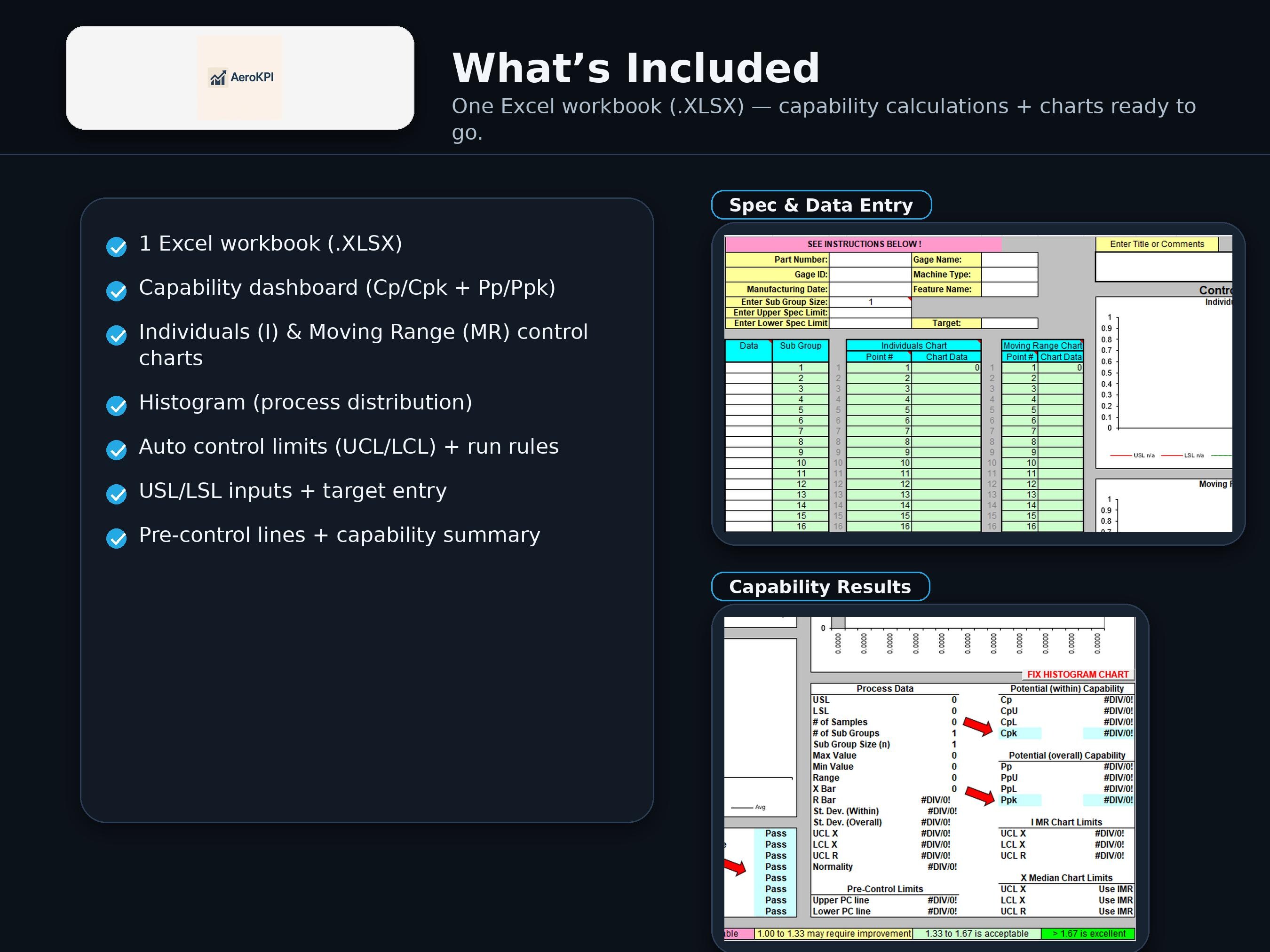
- Enter your raw data into the “Raw Data” sheet—just copy and paste from your measurement system.
- In the “Settings” sheet, set your lower and upper specification limits. If you’re measuring diameter in millimeters, set LSL to 10.0 and USL to 12.0, for example.
- Click the Calculate button on the “Dashboard” sheet. It’s a one-click wonder that will populate everything else.
What Happens Under the Hood
The template uses built-in Excel formulas and a few hidden macros to calculate:
- Mean (average)
- Standard Deviation (spread)
- Cp, Cpk, Ppk
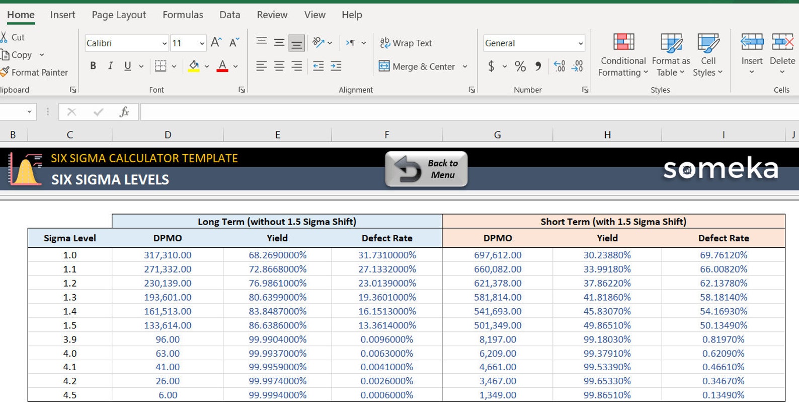
- Sigma level (how many standard deviations your process sits within spec limits)
- Defect rates (using the defect per million opportunities, DPMO)
All these are displayed in neat charts that look like they’re from a modern art museum, not a spreadsheet.
Step‑by‑Step Deep Dive
Step 1: Data Integrity First
Before you even think about the fancy indices, check for:
- Missing values—Excel loves a good NA! but your process doesn’t.
- Outliers—use the QUARTILE function to identify and decide whether to keep or remove them.
- Consistent units—millimeters, inches, grams—mixing them is like mixing coffee and tea.
Step 2: Set the Limits
In the Settings sheet, type your Lower Specification Limit (LSL) and Upper Specification Limit (USL). The template automatically calculates the tolerance (USL minus LSL). If you forget, the template will throw a friendly red warning.
Step 3: Hit Calculate
Press the Calculate button. The template does the heavy lifting: it pulls raw data, runs statistics, and updates visual dashboards—all with zero effort from your side.
Step 4: Interpret the Dashboard
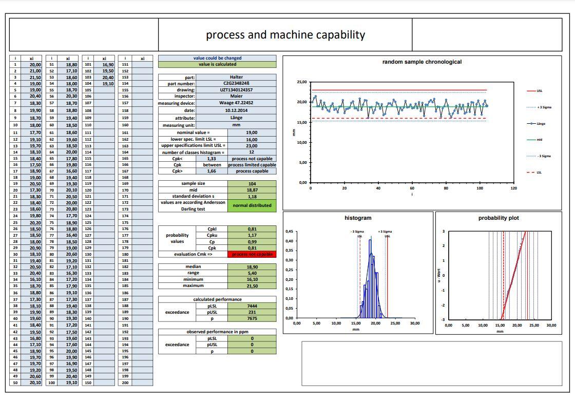
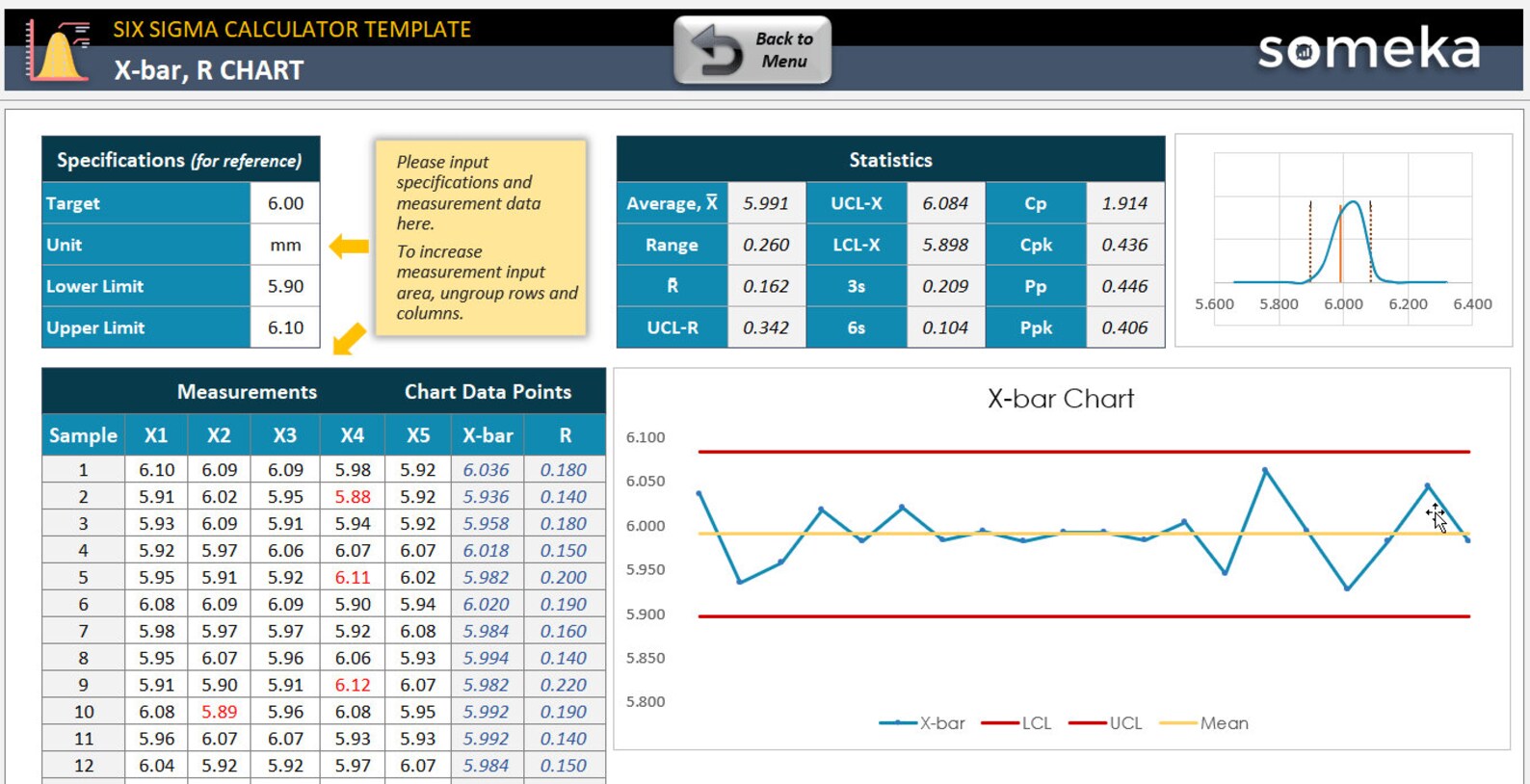
Your dashboard is divided into three main panels:
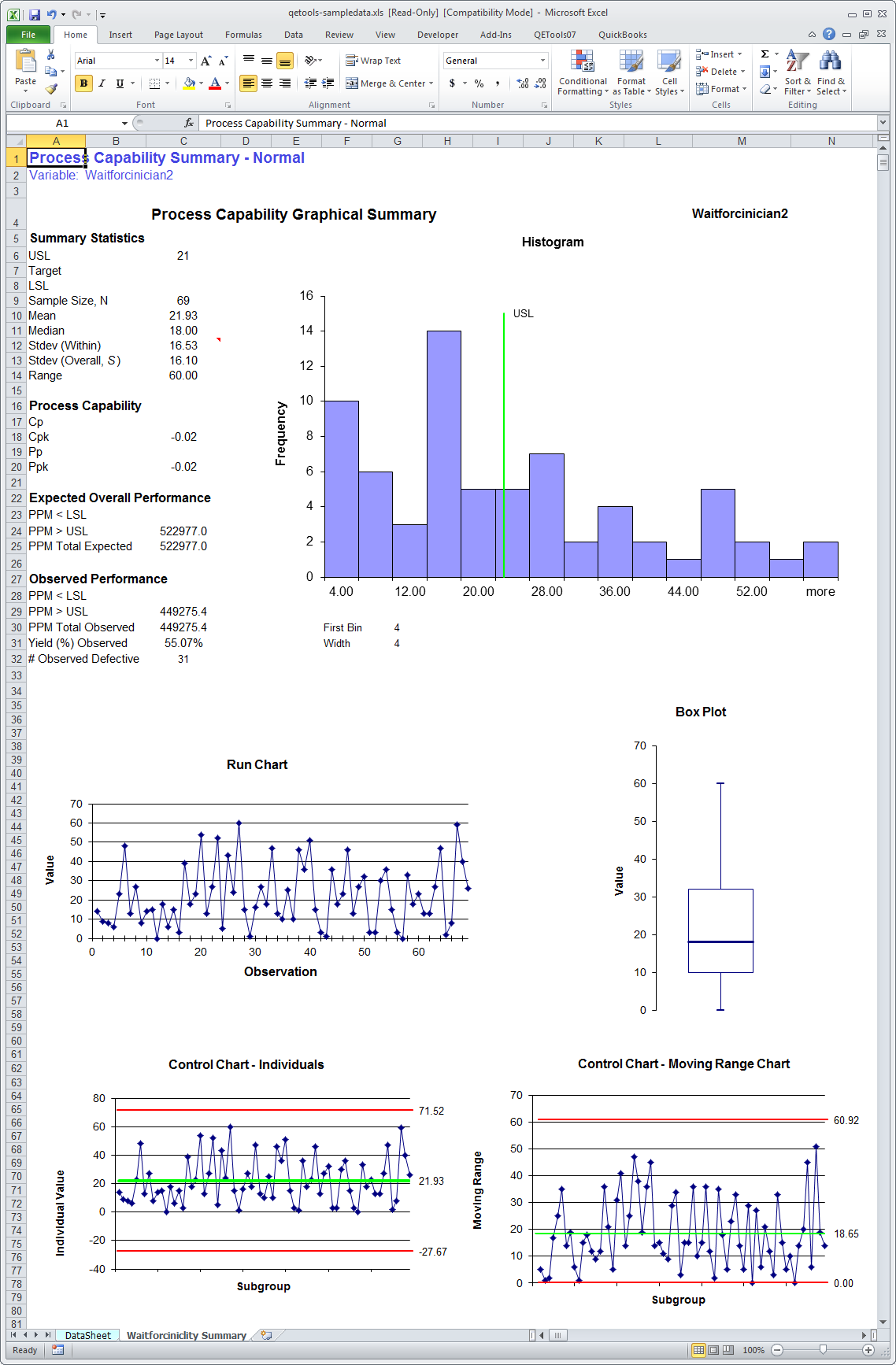
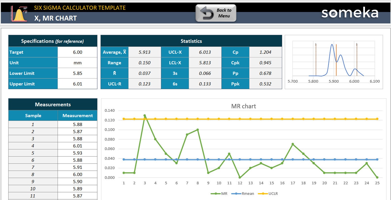
- Statistical Summary – shows mean, std dev, Cp, Cpk, Ppk.
- Process Capability Histogram – a bell curve with spec limits marked.
- Defect Rate Breakdown – DPMO and nonconforming %.
When you see a p‑value above 0.05, you can breathe easy—your process is statistically consistent with the target. Below that, you might need to investigate.
Step 5: Document Your Findings
Use the built-in Report button to export a PDF snapshot of your results. This is perfect for sharing with stakeholders without them needing to open Excel. Or just print it out and hang it on your office wall like a proud achievement.
Real‑World Use Cases

Case Study 1: Precision Bearings
Company A manufactures ball bearings for high‑speed machines. Their tolerance is ±0.01 mm. Using the template, they discovered that their Cpk dropped from 1.65 to 1.20 after a machine maintenance event. The template’s histogram immediately highlighted the shift, and the team pulled the machine for recalibration—saving thousands in potential rework.
Case Study 2: Paint Coating Thickness
Paint supplier B needed to ensure each paint roll had a thickness between 50 and 70 microns. Their data showed a slight bias toward the lower end. The template’s Cpk calculation identified a Cpk of 1.05, just above the 1.00 threshold. They adjusted the spray gun pressure and saw the Cpk jump to 1.35 in the next run.
Case Study 3: Electronics PCB Trace Width
Electronics manufacturer C had a spec of 0.2 ± 0.005 mm for PCB trace widths. With a tight tolerance, they used the template to monitor every batch. One batch hit a Cpk of 0.95—an immediate red flag. The template’s histogram revealed a left‑skewed distribution, prompting the QA team to investigate the PCB etching process.
Common Pitfalls and How to Avoid Them
Ignoring Non‑Normal Data
The template assumes a normal distribution. If your data is skewed, consider using the Box‑Cox transformation or a non‑parametric analysis. Excel’s LOG or POWER functions can help.
Over‑Focusing on One Metric
Remember: Cp is great, but it doesn’t account for centering. Always look at Cpk or Ppk as well. Think of Cp as the speed limit and Cpk as the speed limit plus how close you’re staying to the lane.
Data Overload
More data isn’t always better. If you’re pulling every single measurement, your spreadsheet can become unwieldy. Sample strategically: 30–50 random points per batch give a solid estimate of the spread.
Customizing the Template for Your Needs
Adding Custom Metrics
Excel’s IF and VLOOKUP functions let you add new columns. For example, create a column that flags any measurement outside spec with a “Fail” tag. Then use conditional formatting to color code failures in red.
Embedding a Dashboard in Power BI
If you love Power BI, export the Dashboard sheet as a CSV and import it into Power BI for interactive visualizations. You can set up alerts that pop up on your phone when Cpk falls below a threshold.
Automating Data Import
Use Excel’s Power Query to pull data directly from your measurement system. This reduces manual copy‑pasting and keeps your analysis up to date in real time.
Fun Side Note: Excel Is Still a Spreadsheet, Not a Stand‑Up Comedian
While we joke about Excel’s “funny” side, remember that spreadsheets are tools. Treat them with the respect they deserve: keep them clean, documented, and backed up. A messy workbook is like a joke that falls flat—no one gets it.
Wrap Up
With the Process Capability Analysis Excel Template, you can turn raw measurements into actionable insights in seconds. By following the step‑by‑step guide above, you’ll be able to:
- Validate your process against specs quickly.
- Spot shifts or biases before they cause costly defects.
- Communicate results to stakeholders with clear charts and reports.
- Maintain a culture of continuous improvement.
So next time you open Excel, think of it as a comedy club for your data—every calculation a punchline, every chart a laugh track. And when your process finally meets or exceeds its specifications, you’ll know that the template, and a little humor, saved the day. Happy analyzing!